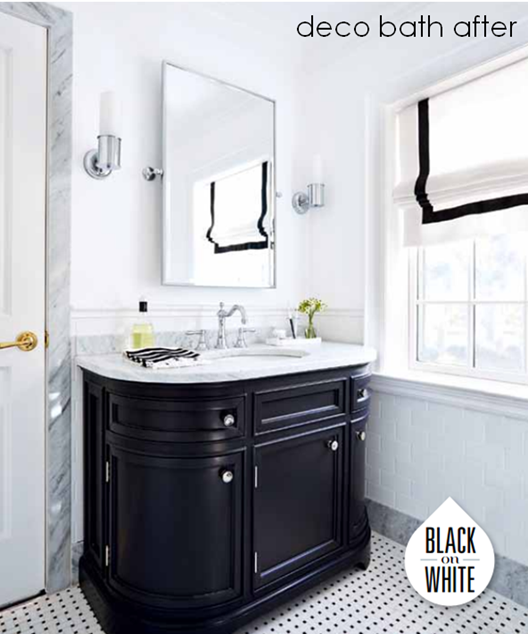
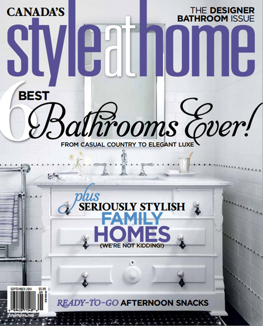
Knowing me, it’s not a total shocker that black and white was my choice palette for more than one of the bathrooms in my home. The September issue of Style At Home features what I like to call my deco bath, which earned its moniker thanks to its original 30s bathtub and vintage-inspired scheme.
When we bought the house it was clear that this bathroom hadn’t been updated since it was built in the 1930s. The tile and cast iron corner tub were worse for wear and there was no central vac system or updated plumbing installed.
The bathroom was originally used by three bedrooms, but because we were adding a brand new bathroom to the second floor during the addition, I decided to close off one of the doorways that led into the hall and make this bathroom into an ensuite instead.
I loved the graphic hand-cut porcelain tile floor but because the radiator needed to be ripped out and new plumbing was required, it was regrettably unsalvageable.
I decided to replace it with a similar pattern in a marble mosaic from Antica Tile and Stone. The basketweave is a classic look and we grouted it in white and then ground the whole surface down for an extra smooth and seamless finish.
Choosing a black painted vanity, which also echoes the curved deco lines of the bathtub, ties the vintage black and white scheme together. The Carrera marble vanity top also picks up on the coordinating marble baseboards and doorframe.
I sourced beautifully detailed plumbing fixtures from Brizo to complement the retro look of the tub and vanity. I picked the Tresa Two Handle Widespread Lavatory Faucet after falling in love with its high arched spout and delicate bead detail at the top.
I was happy to keep the original cast iron tub, which had the perfect footprint for the bathroom. The tub looks brand new and gleaming white thanks to a reglazing job from Dr. Tubs. For the shower/tub plumbing fixtures, I wanted something equally retro, so I chose the Baliza set from Brizo in a dazzling chrome finish, which completed the Tresa lavatory faucet beautifully.
Clean and classic accessories that repeat the simple bead detail in their design, like this traditional towel bar by Brizo and the Metropolitan sconce from Circa Lighting complete the look.
The soft elements, such as the shower curtains from Target (a favourite pick I repeated from my apartment) and window treatment also reinforce the palette. For the custom roman shade, I added a border of black grosgrain from Mokuba to the white linen I picked up from Designer Fabrics, and the result looks clean and classic.
Make sure to pick up the September issue of Style At Home for a detailed Q&A on the bathroom design, along with tons more gorgeous bathroom inspiration from talented designers like Tara Fingold and Ingrid Oomen.


