Thursday, May 7, 2015
**NEW BLOG URL** WWW.JESSICACLAIREINTERIORS.COM/BLOG
Friday, April 3, 2015
Jack and Charlie’s Nursery: Part Two
Having twins meant I had to get creative with the furniture layout of the nursery. I had designed the footprint of this bedroom as part of the second floor addition and had only counted on fitting one crib.
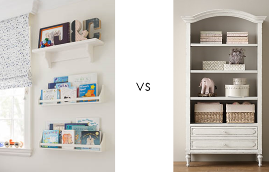
Once we found out twins were on the way I knew I’d have to do away with any extraneous furniture. I bid farewell to the sizeable bookshelf I had been counting on and said hello to wall-mounted shelving from Pottery Barn Kids for display and book storage instead.
For safety reasons, cribs shouldn’t be situated in front of windows, so I had to keep that in mind when space planning. I ended up putting the two cribs on the longest side wall and set the dresser/change station in front of the window, with the glider and ottoman in the other corner. The room sports a decent sized closet so I chose a dresser with a combination of drawers and cubbies which made keeping items like swaddling blankets and bibs and burp cloths easily accessible. Selecting storage baskets from the Land of Nod in a bright blue added an extra dose of colour to the white furniture.
I chose the beautifully detailed Jack and Jill crib from Mother Hubbard’s, a local manufacturer. I liked that all of their pieces are made right here in Toronto using nontoxic lacquers and their line is highly customizable with a variety of finishes and hardware to choose from. I chose a white painted finish for the furniture because it’s clean and classic. If money were no object, I may have tried a rich navy, but Canadian-made solid wood baby furniture isn’t cheap, so it’s better to invest in something neutral. The cribs have beautiful moulding details and look great set against the back wall.
Bedding is a funny thing when decorating a nursery, because technically you’re really only supposed to have one thing in the crib: a simple crib sheet. The gorgeous quilts and bumpers all the catalogues and stores show as a bedding set are a no-no these days due to SIDS concerns (they can cause suffocation and decrease the oxygen flow around the baby’s face). If you want another layer, you can add a decorative crib skirt like this graphic one from Serena and Lily that we used.
For the shoot, I layered in some extra quilts we use for snuggling on the glider for styling purposes, but these are not part of the boys’ sleeping routines. If you’re insistent on bumpers because your kids are head bangers (like ours!), you can use these breathable mesh crib bumpers which cushion the perimeter of the crib while still allowing for air flow.
The final piece of the nursery furniture puzzle is our glider, which admittedly was a head scratcher for me. When sourcing potential options I didn’t know whether I should get a ginormous extra wide one that I could breastfeed both babies on? If I should get a daybed or just a normal sized rocker? Did I need an ottoman? In the end, I chose the Rena swivel glider from Rooms To Grow. It is generously proportioned and I loved its clean lined track arms and pretty skirt. White contrast piping gives the glider a detailed yet crisp look.
Having closed the chapter on nursing and looking back, I would advise breastfeeding twin moms to stick with a normal sized glider and ottoman. The ottoman is essential for putting your feet up and balancing comforting two babes comfortably. If you have the space and plan on tandem feeding, a daybed or smaller sofa is a great thing to have, but if you don’t have space don’t sweat it. When I tandem fed, I just set up camp elsewhere (I used the guest room and our very deep sofa in the family room as my nursing quarters)
Finishing touches like the vintage chandelier that hung in my grandparents’ home for decades gives the room an eclectic and personal feel. Other sweet touches include the large Hansa stuffed deer from Advice from a Caterpillar, which was a gift that the boys love playing with. I also like it because it’s a little less expected than the standard enormous giraffes you see in most magazines.
(Nursery photos by Donna Griffith for Style At Home)
Sunday, March 8, 2015
Jack and Charlie’s Nursery: Part 1
Nurseries are one of the most popular and fun spaces to decorate (at least according to my pinterest feed), so where do you start when you’re a decorator and finally designing your very first baby room for your own littles? Now that the April issue of Style At Home is out on newsstands, I can finally share how I designed Jack and Charlie’s nursery.
In the days leading up to my first ultrasound, I let myself fantasize over the pretty fabric samples I had been hoarding over the years for my future little girl’s room. (As one of four girls, I was convinced I would be giving birth to at least one little lady down the line) When I found out I was having identical twin boys (what the what?) I had to throw out most of the ideas and start from scratch. Luckily there was one well-suited print I had tucked away at the back of my mind.
As a design editor at a decorating magazine, I received media releases about new fabric and wallpaper collections almost every week. As soon as the press package for Osborne and Little’s Penguin Library wallpaper crossed my desk I knew I would be using it some day down the line in a project. It was just so me. The bright colour covers mixed with the black and white penguin branding makes for serious eye candy and I couldn’t resist the sense of retro nostalgia it evoked.
The wallpaper appealed to me for the nursery for a number of reasons. I loved the idea of fostering a love of books with my boys right from the start and I thought it was a safe investment to choose something gender neutral with such a wide array of colours to work with. I pulled out navy, sky blue, periwinkle and orange as my main palette but the room could suit a little girl if ever need be in the future with a few easy changes, such as a new purple small area rug, or hot pink bedding and accessories. The paper is also sophisticated enough that the room could become our office one day - book themed wallpaper is fairly academic after all!
Playing on the penguin theme, I ordered cutie pie felted mobiles from needlenerd. I found Bonnie’s work on etsy and was delighted to discover she lived right here in Toronto. She was kind enough to match the colours of the hearts in the mobile to the colours seen in the wallpaper so they coordinate perfectly. A fun fact is newborns only see in black white the first few weeks as their eyes develop, so the boys were madly in love with gazing up at the black and white penguins!
The other main print in the room is the fabulous splatter embroidered drapery fabric, Skittles, from Lulu DK children’s collection for Schumacher. The sky blue has a purplish undertone so it doesn’t scream “little boys only” and the print is youthful while still being chic and timeless. Investing in black out lined drapery was imperative to maintaining a good nap schedule- good window treatments (with brackets to keep dangling cords out of harm’s way) is one area of nursery decor that you should not skimp on!
In a perfect world I’d have added extra embellishment with navy pom fringe on the leading edge of the drapery panels, like these ready-made panels from PB Teen, and the perimeter of the roman shade, but I had to exercise restraint for budget sake. Budget also meant I couldn’t paint out the ceiling in a soft sky blue- something I was also was keen on doing to punch up the white envelope of the room.
To balance out the strong patterns of the drapery and accent wallpaper behind the crib, I decided to go bold with the framing of my artwork on either side of the window. I chose navy frames with periwinkle mats from PI Fine Art for the lovely watercolours I purchased from Mary’s Flower Garden on etsy. Both my husband and I are major animal lovers and so we welcomes the idea of adding more fauna into the existing penguin mix.
This snapshot also shows a separate little watercolour we purchased of two baby elephants together. We framed these twin babies without the blue mat, but added an orange filler to the frame to tie in our accent colour. The shelf also shows off whimsical letters made out of old library books from Anthropologie that serve as another extension of the book theme.
The last literary nod comes courtesy of the artwork on the other side of the cribs by Olive and Birch, another etsy artist. They feature favourite quotes from two of my top children’s books, Peter Pan and Goodnight Moon. What a sweet send off into slumber!
For details on the furniture and accessories stay tuned for part two!
(Top photo and baby blocks photos by Donna Griffith, Family shot with mobiles by Scarlett O’Neill)
Saturday, January 10, 2015
Buzzing Like Neon
While in Miami I’ve had a chance to poke my nose into some of my favourite boutiques in the design district. One of my top finds was spotted at Threadcount, a fabulous linen shop I love browsing in that carries luxury lines like Pratesi as well as some gorgeous tabletop and bathroom accessories.
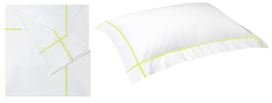
I fainted over one of their model beds in the window dressed in the neon Athena sheets by Yves Delorme. I’m so used to seeing hotel-style linens in black or navy but this bright neon yellow is so fresh and edgy.
I know neon isn’t anything new, but seeing the trend interpreted in such an unexpected way definitely caught my eye! I’d pair this set with a black and white scheme for a bold bedroom that oozed punk-tinged luxury.
Monday, December 29, 2014
Pop. Fizz. Clink: Champagne Cocktails
2014 has treated me exceptionally well with two happy and healthy babies and a stylish send off into the next decade. I’m hoping for anther rosy year so what better way to usher it in than sipping a festive pink champagne cocktail?
Style At Home recently highlighted some delicious new years eve-worthy champagne cocktails, styled in tones of gold and pink by my talented colleague Ann Marie Favot. I’m partial to this blackberry lime fizz, which features one of my favourite liqueurs, St Germain Elderflower.
Blackberry Lime Fizz
serves 2
- 6 fresh blackberries
- 2 tbsp freshly squeezed lime juice
- 1 tbsp simple syrup
- 2 oz St-Germain elderflower liqueur
- 8 oz chilled pink champagne or Prosecco
Directions
- Place 6 blackberries on a parchment paper-lined baking sheet and freeze until solid (the frozen fruit will help keep your cocktail nicely chilled).
- Place the lime juice, simple syrup, elderflower liqueur and remaining blackberries in a cocktail shaker and muddle to release the flavours.
- Add some ice and shake well. Strain into two coupes and top with the champagne.
- Garnish with the frozen blackberries.
Bonus points if you mix your cocktail in these gorgeous gold-plated accessories from Cocktail Kingdom. I need that shaker, jigger and stirrer like yesterday!
(cocktail photo by Maya Visnyei , bottom photo: laura sant for saveur)


