Showing posts with label dream house. Show all posts

Friday, April 3, 2015

Jack and Charlie’s Nursery: Part Two

Having twins meant I had to get creative with the furniture layout of the nursery. I had designed the footprint of this bedroom as part of the second floor addition and had only counted on fitting one crib.

image

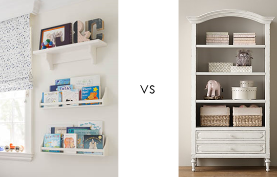
Once we found out twins were on the way I knew I’d have to do away with any extraneous furniture. I bid farewell to the sizeable bookshelf I had been counting on and said hello to wall-mounted shelving from Pottery Barn Kids for display and book storage instead.

image

For safety reasons, cribs shouldn’t be situated in front of windows, so I had to keep that in mind when space planning. I ended up putting the two cribs on the longest side wall and set the dresser/change station in front of the window, with the glider and ottoman in the other corner. The room sports a decent sized closet so I chose a dresser with a combination of drawers and cubbies which made keeping items like swaddling blankets and bibs and burp cloths easily accessible. Selecting storage baskets from the Land of Nod in a bright blue added an extra dose of colour to the white furniture.

image

I chose the beautifully detailed Jack and Jill crib from Mother Hubbard’s, a local manufacturer. I liked that all of their pieces are made right here in Toronto using nontoxic lacquers and their line is highly customizable with a variety of finishes and hardware to choose from.  I chose a white painted finish for the furniture because it’s clean and classic. If money were no object, I may have tried a rich navy, but Canadian-made solid wood baby furniture isn’t cheap, so it’s better to invest in something neutral. The cribs have beautiful moulding details and look great set against the back wall.

image

Bedding is a funny thing when decorating a nursery, because technically you’re really only supposed to have one thing in the crib: a simple crib sheet. The gorgeous quilts and bumpers all the catalogues and stores show as a bedding set are a no-no these days due to SIDS concerns (they can cause suffocation and decrease the oxygen flow around the baby’s face). If you want another layer, you can add a decorative crib skirt like this graphic one from Serena and Lily that we used.

nursery-twin-boys-wallpaper.jpg

For the shoot, I layered in some extra quilts we use for snuggling on the glider for styling purposes, but these are not part of the boys’ sleeping routines. If you’re insistent on bumpers because your kids are head bangers (like ours!), you can use these breathable mesh crib bumpers which cushion the perimeter of the crib while still allowing for air flow.

image

The final piece of the nursery furniture puzzle is our glider, which admittedly was a head scratcher for me. When sourcing potential options I didn’t know whether I should get a ginormous extra wide one that I could breastfeed both babies on? If I should get a daybed or just a normal sized rocker? Did I need an ottoman? In the end, I chose the Rena swivel glider from Rooms To Grow. It is generously proportioned and I loved its clean lined track arms and pretty skirt. White contrast piping gives the glider a detailed yet crisp look.

nursery-twin-boys-design.jpg

Having closed the chapter on nursing and looking back, I would advise breastfeeding twin moms to stick with a normal sized glider and ottoman. The ottoman is essential for putting your feet up and balancing comforting two babes comfortably. If you have the space and plan on tandem feeding, a daybed or smaller sofa is a great thing to have, but if you don’t have space don’t sweat it. When I tandem fed, I just set up camp elsewhere (I used the guest room and our very deep sofa in the family room as my nursing quarters)

image

Finishing touches like the vintage chandelier that hung in my grandparents’ home for decades gives the room an eclectic and personal feel. Other sweet touches include the large Hansa stuffed deer from Advice from a Caterpillar, which was a  gift that the boys love playing with. I also like it because it’s a little less expected than the standard enormous giraffes you see in most magazines.

(Nursery photos by Donna Griffith for Style At Home)

Sunday, March 8, 2015

Jack and Charlie’s Nursery: Part 1

Nurseries are one of the most popular and fun spaces to decorate (at least according to my pinterest feed), so where do you start when you’re a decorator and finally designing your very first baby room for your own littles? Now that the April issue of Style At Home is out on newsstands, I can finally share how I designed Jack and Charlie’s nursery.

image

In the days leading up to my first ultrasound, I let myself fantasize over the pretty fabric samples I had been hoarding over the years for my future little girl’s room. (As one of four girls, I was convinced I would be giving birth to at least one little lady down the line) When I found out I was having identical twin boys (what the what?) I had to throw out most of the ideas and start from scratch. Luckily there was one well-suited print  I had tucked away at the back of my mind.

image

As a design editor at a decorating magazine, I received media releases about new fabric and wallpaper collections almost every week. As soon as the press package for Osborne and Little’s Penguin Library wallpaper crossed my desk I knew I would be using it some day down the line in a project. It was just so me. The bright colour covers mixed with the black and white penguin branding makes for serious eye candy and I couldn’t resist the sense of retro nostalgia it evoked.

image

The wallpaper appealed to me for the nursery for a number of reasons. I loved the idea of fostering a love of books with my boys right from the start and I thought it was a safe investment to choose something gender neutral with such a wide array of colours to work with. I pulled out navy, sky blue, periwinkle and orange as my main palette but the room could suit a little girl if ever need be in the future with a few easy changes, such as a new purple small area rug, or hot pink bedding and accessories. The paper is also sophisticated enough that the room could become our office one day - book themed wallpaper is fairly academic after all!

image

Playing on the penguin theme, I ordered cutie pie felted mobiles from needlenerd. I found Bonnie’s work on etsy and was delighted to discover she lived right here in Toronto. She was kind enough to match the colours of the hearts in the mobile to the colours seen in the wallpaper so they coordinate perfectly. A fun fact is newborns only see in black white the first few weeks as their eyes develop, so the boys were madly in love with gazing up at the black and white penguins!

image

The other main print in the room is the fabulous splatter embroidered drapery fabric, Skittles, from Lulu DK children’s collection for Schumacher. The sky blue has a purplish undertone so it doesn’t scream “little boys only” and the print is youthful while still being chic and timeless. Investing in black out lined drapery was imperative to maintaining a good nap schedule- good window treatments (with brackets to keep dangling cords out of harm’s way) is one area of nursery decor that you should not skimp on! 

image

In a perfect world I’d have added extra embellishment with navy pom fringe on the leading edge of the drapery panels, like these ready-made panels from PB Teen, and the perimeter of the roman shade, but I had to exercise restraint for budget sake. Budget also meant I couldn’t paint out the ceiling in a soft sky blue- something I was also was keen on doing to punch up the white envelope of the room.

image

To balance out the strong patterns of the drapery and accent wallpaper behind the crib, I decided to go bold with the framing of my artwork on either side of the window. I chose navy frames with periwinkle mats from PI Fine Art for the lovely watercolours I purchased from Mary’s Flower Garden on etsy. Both my husband and I are major animal lovers and so we welcomes the idea of adding more fauna into the existing penguin mix.

image

This snapshot also shows a separate little watercolour we purchased of two baby elephants together. We framed these twin babies without the blue mat,  but added an orange filler to the frame to tie in our accent colour. The shelf also shows off whimsical letters made out of old library books from Anthropologie  that serve as another extension of the book theme.

image

The last literary nod comes courtesy of the artwork on the other side of the cribs by Olive and Birch, another etsy artist. They feature favourite quotes from two of my top children’s books, Peter Pan and Goodnight Moon. What a sweet send off into slumber!

For details on the furniture and accessories stay tuned for part two!

(Top photo and baby blocks  photos by Donna Griffith, Family shot with mobiles by Scarlett O’Neill)

Thursday, October 30, 2014

My Master Bath Before and After

The latest bookazine from Style At Home is all about makeovers and it's a goodie! Chock full of dramatic before and afters, there is page after page of inspirational images that will get your creative juices flowing and ready to tackle your next project.

image

My master ensuite, which we worked on as part of our big reno last year, is featured and it shows how we transformed a tiny cramped bath into a sophisticated and relaxing retreat.

image

Categorizing it as a makeover is an understatement because literally nothing remains from the original space. The bathroom was teensy and poorly laid out with a wee wall-mounted sink, toilet and narrow tub/shower. Thanks to walls that jutted out awkwardly to accommodate two separate closets on each end, it was a very weird shape and there was no way the bathroom could be used comfortably for more than one person at a time.

image

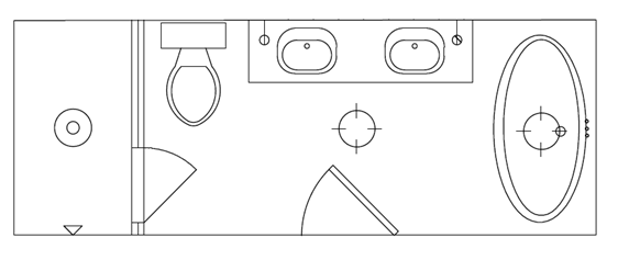
We opened up and lengthened the space into a long rectangle by demolishing the two closets and borrowing some extra feet from a nearby bedroom. The plumbing was reconfigured to accommodate a double vanity, large shower and separate bath tub for a luxurious master ensuite retreat.

image

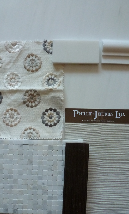
I wanted the space to feel like a properly appointed salon and not a regular old bathroom, so I brought in details you’d see in a living room, including textured wallpaper, a chair rail, and herringbone floors for a richer atmosphere. I reinterpreted these elements in bathroom-friendly materials, such as Philip Jeffries’ vinyl glam grass for the wallpaper from Crown Wallpaper, marble for the chair rail, and porcelain tiles for the floor.

image

I used a timeless palette of whites and cream stones from Marble Granite Depot, paired with the rich walnut tones of the faux-wood tiles from Stone Tile. All these colours are seen in the roman shade fabric, a small scale embroidered pattern from Crown Wallpaper & Fabrics that ties it all together beautifully.

image

The plumbing fixtures are classic and refined with cross handle details. I mixed Brizo’s Tresa lavatory faucet for the vanities with the luxurious Raincan shower head and Charlotte slide bar with shower. Having the relaxing large rain shower head is a real treat, but having a removable shower head is just as key when it comes to ease of cleaning so I am loving the combo of the two!image

Brizo doesn’t make a deck mounted telephone style tub filler, but Rubinet has a wonderful selection of tub fillers, so I chose their Raven design which complements the other faucets nicely. The various fixtures are united in a warm polished nickel finish which plays off the rich tones of the floor tile and colours in the roman shade. I was even able to order the legs of the Cheviott clawfoot tub from Vintage Tub & Bath in polished nickel as well for a truly cohesive look.

image

I love how the refined vintage vibe of the bathroom is an extension of the rest of my home’s décor. The dramatic clawfoot tub, framed antique prints and pleated shades on the beautiful Payson sconces from Circa Lighting reinforce a warm and glamorous mood that makes getting ready in the morning a pleasure.

image

Seeing the bathroom come together on the page is very rewarding considering it was probably one of the most complicated spaces to deal with during the entire reno. So much can go wrong in any given project, but this bathroom took us to a whole other level of insanity!  There were extreme variations in the natural stone mosaic I selected for the shower which meant that part of the shower walls had to be ripped out and new tile sourced at the eleventh hour, the tub filler ended up being too deep for the tub and had to be shortened which took weeks, two separate parts of the tub were missing and caused delays until each one was received and could be hooked up, a wallpaper mix-up, the list goes on…you name it and it probably went wrong or delayed us! I’m justso happy it’s done and that I get to enjoy it every day!

(after photos by Donna Griffith)

Tuesday, July 29, 2014

My Deco Bathroom in Style At Home: Before and After

Knowing me, it’s not a total shocker that black and white was my choice palette for more than one of the bathrooms in my home. The September issue of Style At Home features what I like to call my deco bath, which earned its moniker thanks to its original 30s bathtub and vintage-inspired scheme.

image

When we bought the house it was clear that this bathroom hadn’t been updated since it was built in the 1930s. The tile and cast iron corner tub were worse for wear and there was no central vac system or updated plumbing installed.

image

The bathroom was originally used by three bedrooms, but because we were adding a brand new bathroom to the second floor during the addition, I decided to close off one of the doorways that led into the hall and make this bathroom into an ensuite instead.

image

I loved the graphic hand-cut porcelain tile floor but because the radiator needed to be ripped out and new plumbing was required, it was regrettably unsalvageable.

image

I decided to replace it with a similar pattern in a marble mosaic from Antica Tile and Stone. The basketweave is a classic look and we grouted it in white and then ground the whole surface down for an extra smooth and seamless finish.

 image

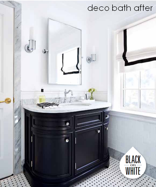
Choosing a black painted vanity, which also echoes the curved deco lines of the bathtub, ties the vintage black and white scheme together. The Carrera marble vanity top also picks up on the coordinating marble baseboards and doorframe.

65336LF-PC

I sourced beautifully detailed plumbing fixtures from Brizo to complement the retro look of the tub and vanity. I picked the Tresa Two Handle Widespread Lavatory Faucet after falling in love with its high arched spout and delicate bead detail at the top.

image

I was happy to keep the original cast iron tub, which had the perfect footprint for the bathroom. The tub looks brand new and gleaming white thanks to a reglazing job from Dr. Tubs. For the shower/tub plumbing fixtures, I wanted something equally retro, so I chose the Baliza set from Brizo in a dazzling chrome finish, which completed the Tresa lavatory faucet beautifully.

image

Clean and classic accessories that repeat the simple bead detail in their design, like this traditional towel bar by Brizo and the Metropolitan sconce from Circa Lighting complete the look.


image

The soft elements, such as the shower curtains from Target (a favourite pick I repeated from my apartment) and window treatment also reinforce the palette. For the custom roman shade, I added a border of black grosgrain from Mokuba to the white linen I picked up from Designer Fabrics, and the result looks clean and classic.

image

Make sure to pick up the September issue of Style At Home for a detailed Q&A on the bathroom design, along with tons more gorgeous bathroom inspiration from talented designers like Tara Fingold and Ingrid Oomen.

(After photos by Stacey Brandford)

Wednesday, April 2, 2014

Thank You Bloggers

Thank you so much to Christine Dovey, Tim Lam, Nancy Marcus, Ashlina Kaposta and Bárbara Wieliwicki de Resende for the amazingly complementary posts about my home these past couple of weeks!

image

After working on the project for a rollercoaster ride lasting months and months it was such a thrill to finally be able to share the finished product in Style At Home, and your feedback is extremely encouraging. It’s so nice to be acknowledged in such a kind way by likeminded design aficionados.

Thank you for the sweet words and for sharing it with your readers!

Tuesday, April 1, 2014

The Making of My Custom Master Bedroom Rug at ELTE

image

My venture into ELTE’s custom rug department was the result of falling head over heels with their silk orchid collection.

P1040845

Made of deconstructed silk saris, the collection’s luminous colours and graphic ikat designs were so gorgeous and worked perfectly with my vision of grounding an otherwise white bedroom with a jaw-dropping rug.

master- rug pattern

Unfortunately I didn’t have a five digit budget, which is how the large silk orchids roll, but I did, however, realize that I could get the same global look by customizing the colours of their wool ikat design. Not only was this a more accessible material, but wool is also a more practical choice considering it can be spot cleaned easily – a must for pet owners like us!

image

Once I had nailed down a more cost-effective material and the ikat pattern, I needed a show-stopping colour palette that would be totally  fabulous, but not too alienating for my husband’s tastes. As mentioned in the previous post, I found my inspiration for a unique blend of hues in a stunning Hermès scarf.

master- elte rug 4

I worked with Jamie Metrick, general manager and head buyer of the rug department (and the third generation of his family to work at ELTE, which his great grandfather founded in 1919!) on the rug order and it was obvious from our meeting that the sky is the limit when it comes to the custom rug department executing a creative vision. Jamie and his team were so knowledgeable about anything and everything to do with floor coverings so it was a treat learning about the process and getting their input on the design.

master- elte rug 1

Choosing from the hundreds of colours of wool was daunting but so much fun, and eventually we whittled it down to a sky blue, deep purple and navy on an ivory background (which is the whitest colour of wool available).

master- elte rug 3

Not only did colours have to be chosen, but placement had to be decided on as well. I ultimately specified the larger centre diamond in the pattern to be in the deep purple in order to make the light blue pop, with the smaller diamonds surrounding it in navy.

master- rug sample edie

After a computer drawing of the pattern and colours was provided for me to sign off on, a sample was ordered so I could get an idea of what the rug would look like to confirm everything. Because I wasn’t sure if a true navy would be too dark and read as black, I requested one half of the sample we woven with a lighter blue to see what would work best. In the end I chose the darker navy, which looked more graphic and rich. Edie enjoyed testing out the sample herself (and even puked on it coincidentally)

master- rug making

After signing off on the sample, production began on the finished product. I was even sent a photo of the weavers at work! Seeing the artisans creating my rug was such a treat and definitely lets me appreciate the artistry under my feet every day.

(bedroom photos by stacey brandford)

Thursday, March 27, 2014

A Chic Retreat: My Master Bedroom

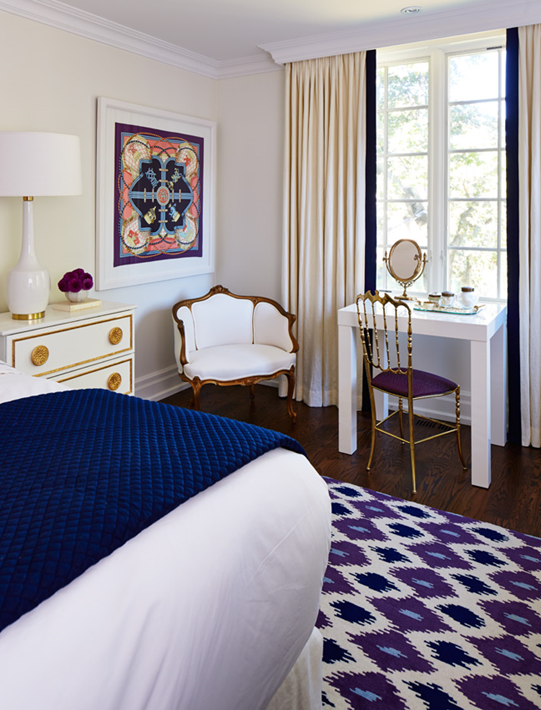
The master bedroom was part of our second floor addition, and while it’s not a huge space, it more than serves its purpose as a luxurious room to relax and rejuvenate in with a king size bed, small vanity and a bank of dressers for tons of clothing storage.

image

I’ve always been on board with calming fluffy white bedrooms, but I decided to shake it up by introducing a major statement rug and some other attention-getting accents. The result is still a very restful space, but the bold hit of pattern and colour give it more personality.

master- scarf

I needed a palette that would be grounding and not too feminine, and I found my unlikely colour combination  inspiration in this dreamy Grand Tenue Hermès silk scarf which features my favourite regal violet, classic navy and a cheerful sky blue.

master- rug preview

I took the colour inspiration to ELTE where it was translated into a custom ikat rug.  The three colours are so vibrant and I love the eclectic ethnic vibe it adds to the space.  The making of the custom rug was such an interesting process, that I’m going to be chronicling how it came together in a separate post later this weekend so stay tuned for that.

image

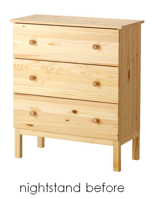
The nightstands were the result of an IKEA tarva hack us design editors did for a special makeover issue of Style At Home. After all that gold leafing, I knew I wanted to enjoy the fruits of my labour past the shoot, so I cut down the legs by a few inches so they would sit at a more bed-friendly height. I love all the extra storage it provides but I am, however,  not in love with how the drawers glide (they’re always getting stuck), so one day hopefully they can be replaced with the inspiration behind the hack: Suzanne Kasler’s tuxedo chests in a creamy ivory lacquer.image

Because the headboard was so tall, I wanted lamps with presence. The Nola lamps by Mitchell Gold + Bob Williams that I picked up at ELTE were a perfect fit with their elongated base and gold accents, which tied them to the nightstands perfectly. 

For the headboard, I went with the tall upholstered Milano from Barrymore Furniture with simple clean lines and three rows of button tufting. I used a creamy ivory linen, Fabricut’s Brother in Snow, which complements the warmer ivory tones of the wool carpet. I chose a headboard only, as opposed to an upholstered bed frame, because I like having access under the bed. In order to give that same finished look as a platform bed, I had Cooper Bros. sew a custom bedskirt in the same linen – a great cost-savings trick that can also be sent out for cleaning if needed.

Scallop

For the bedding, I visited my favourite linens boutique in Toronto, Au Lit Fine Linens. I have always loved the hotel look, with a graphic banding detail, but for extra pizzazz, I decided to go with their scallop design. Outlined in navy as opposed to a more girly colour, it tones down the frill factor while still looking very refined.

image

Even though the headboard and drapery fabric is a warmer ivory, I decided to go with classic white sheets instead of matching it directly to the headboard. The cream was beautiful, but white is a total classic that you can’t go wrong with, and custom king size bedding is an investment that you want to ensure will work for you over time! If you’re into beautiful beds like me, be sure to check out my “in bed with” post on the Au Lit Blog for more

master- blue mu

To top off the scalloped bedding, I chose a single rectangular Madeline Weinrib cushion in her Blue Mu fabric to echo the ikat rug. A rich navy diamond matelassé coverlet folded at the end of the bed is the final punctuation of colour and completes the bed beautifully.

image

In addition to sewing the bedskirt, Cooper Bros. were also responsible for updating my grandmother’s antique tub chair with a slick new upholstery job. Recovered in Maxwell’s platinum vinyl in pearl, it looks totally fresh and even more importantly, will stand up to wear and tear.

image

The same Fabricut linen as the headboard and bedskirt is used for the blackout lined drapery panels. To bring in a hit of navy, the leading edge of the drapery panels have a wide grosgrain ribbon from Mokuba sewn on. In order for the crown moulding to run uninterrupted across the window (which was specified too large to fit under the moulding ), a plaster valance box was created for one seamless line. The drapery hardware runs underneath on a track, and the result is not only functional but looks very finished as well.

master- chiavari chair

I wanted to pair something traditional with the modern parsons vanity it for some tension and to help tie it to the rest of the house’s gilded accents, so I looked for beautiful vintage options in Miami, I came across pairs of these solid brass bamboo and chiavari chairs. I’ve always loved the classic chiavari design, plus they were already upholstered in purple so it was meant to be!