Friday, February 28, 2014

Foyer Furniture, Lighting and More

When I decided to remove the archway by the front door and extend the foyer deeper into the house, space was created for two separate furniture vignettes: the narrow console table and mirror immediately off the front door and a second grouping in the main artery of the home where entrances into the kitchen, dining room, basement and power room and closets all converge (formerly the kitchen).

image

For the first vignette, I needed a surface for stashing keys, mail and unloading parcels when going in and out of the front door. I found the perfect fit in the vintage greek key florentine console from Decorum Decorative Finds. Besides the obvious presence of my favourite neoclassical motif, I loved the ivory and gold tones which coordinated well with the vintage gilded mirror from FOC IT that I already had in my old apartment. The original marble top that came with the console was wasn’t in the best shape nor the right colour, so instead I used a remnant of calacatta marble leftover from our kitchen island.

image

The second vignette was more about filling a blank wall with something pretty, so I turned it into a moment to show off some of my favourite collections, including cloisonné vases from my grandmother and favourite design books.

image

I connected this second space to the first by using another gold-hued console table and the exact same lighting. The bamboo console was a craigslist find that I had gold leafed by Beresford Inc. (recognize it from this cover?)

foyer- chandeliers

When it came to choosing the lighting, I had my heart set on vintage but couldn’t find a matching pair of crystal fixtures at the right height within my budget. The flushmount crystal fixtures I ended up choosing are from Universal Lighting. The Schonbeck design had the same antique look I was going for but in a semi flush version, which worked with our shorter ceiling height, plus buying new meant I could get the matching pair I was after. Simple plaster ceiling medallions help link and punctuate each vignette.


Joshua Jensen-Nagle - Basking in Polka Dots - Edition of 7

Because there was already a mirror in front of the door, I used one of my favourite pieces of art by local artist Joshua Jensen-Nagle “Basking in Polka Dots.” which used to hang above my setee in our apartment. The pink bench cushion helps pull out the bright dots from the piece and can be easily switched out to add another accent colour.

image

Another element I have to point out from the second vignette are the wall registers. Rather than go with a simple white metal grille for the air return and supply vents, I chose antique-looking wall registers from Antique Door and Hardware that reinforce the traditional vibe of the home. I had considered cast iron models, but went with lighter MDF registers instead that could be inset into the wainscoting and painted out more easily. The result is a seamless look that is decorative yet functional.

image

Finally I have to mention one decision that I literally agonized over for weeks: the stair runner!  I had my heart set on an exotic cat print, but eventually decided to play it safe with a solid rug that wouldn’t fight with the graphic harlequin floor. I chose a simple black carpet and at the suggestion of the fabulous Brant Brown at Reznick Carpets, had it bound in a chic leather cording. The look is subtle but adds a couture-like detail that I admire every time I go up and down the stairs.

image

That’s it for the foyer…next week look out for some looks into how the living room came together!

  (After photos by Stacey Brandford)

Wednesday, February 26, 2014

Foyer Before and After: A Harlequin (Floor) Romance

The most obvious standout element in the foyer is the harlequin marble floor, but it didn’t always look so fabulous…
image
When we first toured the house we would call our home, I was greeted with pale pink as far as the eye could see. The walls and wainscoting were pink as was the wall to wall shag carpeting. The archway closing in the space immediately in front of the door didn’t help from feeling like I was drowning in a bottle of calamine lotion. What kept my eye moving forward though was a charming original carved wooden bannister and crystal basket chandelier which hinted at the potential of the home.
image
By the time we had closed on the house, the owners had torn up the carpet in effort to get the house ready to put on the market and the original hardwood was revealed, including a pleasant surprise of stunning parquet in the foyer. I wanted to preserve it but because we were altering the floorplan so extensively (removing the archway and extending the foyer into where original kitchen stood), I decided to embrace the opportunity and went for one of my favourite flooring motifs of all time: harlequin.
image
I love the black and white diamond pattern so much I even incorporated it into the dancefloor at my wedding using a vinyl covering to hide the ballroom’s blonde wood floor.
image
The dramatic floor pattern consisting of 12x12 rudy black and bianco thassos marble tiles from Marble Granite Depot laid in a diamond pattern extends right from the front door to the entry into the kitchen and family room creating a dramatic sightline that feels classic and glamorous. A border of black marble helps punctuate the pattern and conceals the fact that the archways are not all the same size.
image
One thing to note if you’re going for such a dramatic pattern with stone flooring, is to hire an excellent installer. Natural stone is rarely a solid colour through and through, which is definitely the case for the rudy black tiles from Marble Granite Depot that I selected (they have a milky white veining that was more prominent in some tiles than in others). You need an installer with a discerning eye who will stagger the amount of veining evenly across the room so the impression looks consistent throughout. It’s all about going the extra mile and approving the exact layout of each stone  before laying anything down to avoid costly surprises!
(Foyer photo: Stacey Brandford, Wedding photos: Storey Wilkins)

Tuesday, February 25, 2014

Nursery Scheming and Dreaming: Gender Neutral Grey and Yellow

When designing a nursery for your first child it can be daunting. Do you go with a specific boy/girl focus, or do you stay more neutral so you wouldn’t have to change anything up for your potentially opposite-gendered children down the line? You may not even want to find out what you’re having and have to decorate with both sexes in mind,  staying mostly neutral and then just adding in your colour with wall paint, bedding and accessories…

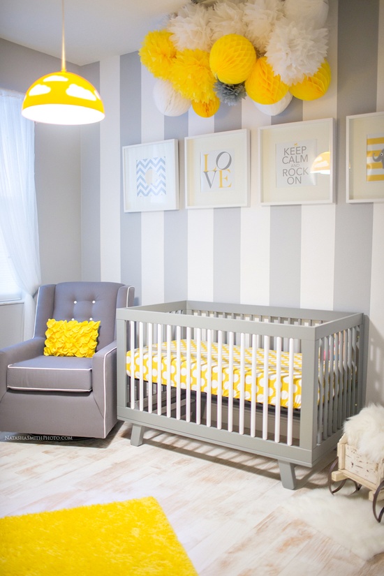
I took all of the above into account when planning my boys’ nursery (more on that later), but first I wanted to share one of my favourite gender neutral nursery schemes: yellow, white and grey. Just look how stimulating yet soft it is in this gorgeous room designed by photographer Natasha Smith:

Lovely Yellow & Grey Nursery (Gallery)

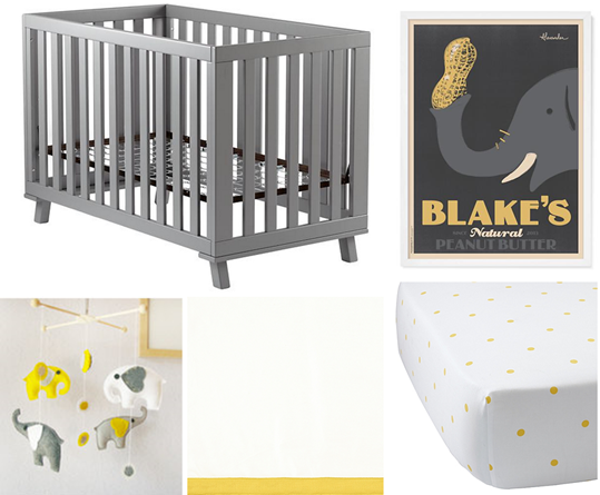
I’m not a grey person myself, but I do it all the time for clients and enjoy creating a palette around the favourite neutral du jour. Paired with sunny yellow and crisp white, here is a grey-based scheme I put together with a positively precious pachyderm theme:


image

Instead of standard wood finishes or white paint, try a grey crib with modern lines and funky flared legs. Bedding in a yellow polkadot with a coordinating yellow-trimmed cribskirt from Serena and Lily is sweet but still feels sophisticated. A handmade felt mobile off Etsy and customizable art from Land of Nod add a second thematic layer to the nursery that also works in the palette: adorable elephants!

image

This small scale print fabric from Tonic Living has an ethnic-look that makes the nursery feel more current and less precious- perfect for investment-worthy window treatments. The pattern is totally something that can be used as the baby grows up or if the room turns into an office or spare bedroom down the line. The dresser with change top is an investment piece from  DucDuc that can be customized in a huge variety of colours and finishes, but you could also get this look by painting out an old dresser in a similar contrasting treatment, adding a change pad topper and switching out the hardware.

image

Ground the pattern in the drapery and bedding with a solid bordered grey rug. A glider with yellow contrast welting  topped with a gorgeous printed lumbar cushion adds decorator details and even more sophistication. Keep clutter at bay and store diapers, creams and lotions in elegant trimmed canvas caddies.

image

A grey washed wood and metal beaded light fixture and cozy elephant-printed blanket add warm texture while a mustard yellow moroccan pouf pick up on the ethnic tone of the fabrics and provide an extra spot to sit or put your feet up. Stack handmade colour-coordinated baby blocks on a floating shelf in your baby’s initials for an extra special custom touch!

Sources: MobileCrib, Elephant Poster, Crib Bedding, Fabric, Dresser, Rug, Cushion, Caddies, Light Fixture, Moroccan Pouf, Baby Blanket, Blocks

Nursery photo: Natasha Smith

Monday, February 24, 2014

Shut the Front Door: Making Your First Impression

The April colour issue of Style At Home has made its way to many subscribers already so I’m going to kick off my behind the scenes tour of how all the rooms in the feature came together with a detailed look at the foyer, which is fittingly the first image in the spread. Captured quite perfectly by the talented Stacey Brandford, the foyer shot also shows off one of my favourite elements in the space: the front door.

image

The front door says a lot about the home you’re about to enter with the particular style, finish and even material giving visitors their first glimpse into your taste. With that in mind, I selected particular door and hardware options that embody the traditional luxe look I envisioned for my home.

Despite my contractor pushing fibreglass, I went with a wood door. It requires more maintenance over time and is more costly, but I couldn’t resist the heft of solid wood and wanted something that looked and felt original to the home. I chose to work with Ridley Windows and Doors, a company renowned for their high-end windows, doors and architectural products and quickly found the perfect style in their Toronto showroom.

image

I wanted a door that would reference the Georgian style of the exterior with glass panels above to let in natural light into the foyer. Another must was enough space below the glass to accommodate a juicy statement knocker. I went with semigloss black finish to complete the other black and white painted accents on the exterior.

For the hardware, I wanted a timeless lockset in polished brass with statement accessories to fit my glamorous vision. I started my search by perusing vintage shops for original knockers with character. I have always been obsessed with lionhead knockers but most of the vintage ones I found had lost their lustre and had too much patina so I ended up choosing a reproduction model in a treated polished brass finish which stays shiny and bright over time.

image

This ornate lion head knocker from Antique Door and Hardware lends a sense of antiquity to the home right from the front door and establishes that warm brass and gold are the choice metals throughout the house.Very rawr!

Tuesday, February 18, 2014

The Best Before and After…

I’ve enjoyed my fair share of interior and furniture makeovers over the years, but I must say my most favourite before and after ever thus far has been transforming from a waddling preggo, into the mommy of  two heart-meltingly sweet human babies.

image

Jack and Charlie are now three weeks old, and I still can’t get over how they started off as one small speck of nothing that decided to randomly split and grow into two separate little dudes. Because they were delivered early at 36 weeks, they’re still pretty tiny (especially Charlie who is still under 5 pounds),  so we’ve been hunkering down at home away from the cold winter and germs. It’s basically baby-induced house arrest, but at least it’s a chic house that we’re stuck in!

image

I am so lucky to have an amazing support system of family and help keeping me afloat amidst our crazy around-the-clock feeding schedule and all the chaos that comes with being a new mom of two newborns - so much so that I’ve even stolen a couple quick moments for some blogging! Look out for some more mommy-centred posts in the coming weeks and I’m excited to share that a second Style At Home feature on my home  is coming out soon in the April issue, so I’ll be sharing behind-the-scenes content about that as well!