Friday, January 24, 2014

Kitchen Tour on The Marilyn Denis Show

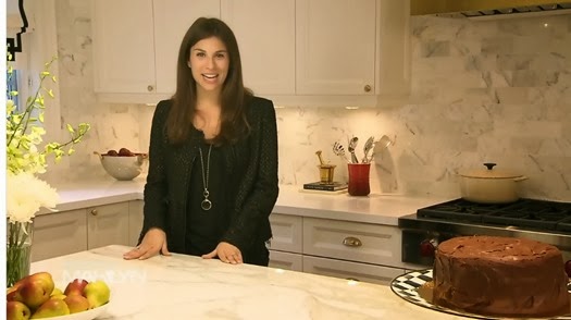
You’ve seen the photos in the magazine and read how it all came together, now see it live and in action in this walkthrough I taped a few months back for The Marilyn Denis Show.

marilyn show kitchen walkthrough 1

Enjoy my Vanna White-esque hand gestures as I show off some of the special features I’ve mentioned in previous posts, such as the Kohler smart divide sink and built-in water dispenser in the Sub-Zero refrigerator.

image

It’s the first piece of tape I have shot with the show and I’m really pleased with how it turned out, which was a relief considering I was at the height of my first trimester nausea and fatigue and was struggling to look alive, yet alone coherent. Good times!

Thursday, January 23, 2014

Puck Love

puckpals1.jpg

I am totally digging this hand silk-screened poster from Toronto illustrator Dave Murray depicting all 30 hockey teams in the NHL. Using figurative symbols, such as a blue maple leaf and a snazzy-looking devil, I like how it adds a sense of cheeky imagination to either a little boy’s room or man cave.

puckpals2.jpg

At only $50 and 22x30, I think it would make a great home-grown gift for your favourite hockey fan.

Wednesday, January 22, 2014

Triangle Sally

I haven’t indulged in any non-maternity or nursing retail therapy in a long long time but there are still some items I can’t help but drool over when browsing the wonderful world of the internet. This geometric metallic triangle sweatshirt from J Crew is in the words of Gretchen Wieners, so fetch.

image

It’s not a total bank-breaker at $78 US and I love how it makes a basic sweatshirt a little more glam so you don’t feel like a shlep when reaching for something cozy (which I’m sure will be the name of the game once the boys arrive!)

Tuesday, January 21, 2014

Delightfully Dipped Vases

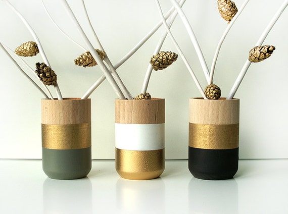
How gorgeous is this trio of dipped wooden vases from Poland-based Etsy shop Shade on Shape?

Set of 3 Painted Wooden Vases Holiday Decor

I know these are styled for holiday, but I would use these year round in my kitchen for casual arrangements. I love how they mix a calmer natural material like raw wood with an unexpected dose of glam gold paint!

Friday, January 17, 2014

Project Glam Kitchen: Furniture and the Family Room

A key factor in planning the addition was ensuring I could create a family room zone for TV watching, lounging and more. It needed to be comfortable and durable enough for kicking back with kids, but still retain my signature glamorous design sense.

waks family room

My husband and I did not see eye to eye on my sofa choice from our apartment which had a tight back, high rolled arms and tufting, so I was determined to give him a cozy sectional that he couldn’t complain about this time around. I went the custom route so I could personalize the design, including a double row of brass nailheads on the top perimeter to down-wrapped seat and back cushions for optimum comfort. For the fabric, I chose Maxwell Fabric’s Soul Mate in Indigo, a rich sapphire-hued polyester chenille that is soft to the touch but can be spot cleaned easily as well. Going with the navy definitely was a departure from the expected black and white, and I love how it gives the room a sense of regal boldness.

button tuft

My tuxedo chair from the apartment makes an appearance here and it pairs perfectly with the sectional thanks to equally sophisticated details like the black velvet contrast welting and button tufting. Both the chair, breakfast banquette and bar stools are upholstered in faux-leathers from Maxwell Fabrics (Platinum in Oyster for the tuxedo chair and Big Horn in Ebony for the banquette and bar stools), so I don’t have to worry about staining.

image

I pulled in the red accents from the kitchen by choosing Kravet’s Reva in Rio, a red croc-embossed vinyl, for the upholstered ottoman that is super durable and different from the other vinyls, thanks to its exotic texture. I chose an ottoman design with a shelf underneath so I could have an extra surface to stash beautiful books and magazines, which tend to pile up quickly in my house. To tie in the red and blue with the black and white, I layered toss cushions that introduced some of my favourite patterns, such as one of my all time fave florals: Designer’s Guild Orangerie through Primavera and a graphic multi-textured stripe: Schumacher’s Leather Stripe in Jet through Bilbrough.

image

To ground it all, I wanted a wool rug that was cushy underfoot, but I needed a pattern that would also be forgiving for life with kittens and kiddies and small scale enough not to overwhelm the other patterns. This cheetah stripe broadloom I ordered from Reznick Carpets complemented the golden finishes throughout the addition perfectly and it looks very sharp bordered in black faux-leather.

image

The vintage bamboo side table was found while on an antiquing excursion in Palm Beach. I snapped it up because its proportions were perfect for the sectional’s depth and I loved how it referenced the chinoiserie breakfast chairs. I had Tim at Beresford Inc. spray over the original cerused wood finish in a glossy black lacquer and kept the antiqued mirror top, which hides scratches excellently.

image

For accent lighting, a classic ivory double gourd table lamp from Robert Abbey with brass detailing harmonizes with the timeless library sconces from Circa Lighting. The sconces help designate the family room area from the breakfast area and the modern pansy prints by Natural Curiosities hung in between them look like they were made for the space. Pansies are one of my fave flowers (they featured heavily at my Bat-Mitzvah luncheon circa 1997), so I ordered these prints a year in advance without even knowing where they’d be hung. Pansies + black + white + gold leaf = no brainer.

(top photo: Stacey Brandford)

Thursday, January 16, 2014

Maternity Moments: Fashion Faves

Once I announced my pregnancy last summer and my bump emerged (which was pretty fast considering there are two hiding in there), I was excited to check out some more comfortable maternity clothes. I could not button up my jeans past 11 weeks and was looking forward to outfits that hugged my bump, as opposed to having material drifting aimlessly around my stomach.

I didn’t want to buy a total new wardrobe, but knew that I needed a host of good basics, including some great dresses to wear to press events for work and other more formal occasions and some great pants and tops to alternate for everyday running around. Here are some of my fave picks that I’m rotating:

image

My best buy has probably been Belly’s wrap dress in a deep navy. Made in Canada, it provides enough coverage up top thanks to a built-in camisole panel (bonus for those of us who already had big busts to contend with before getting knocked up!), and the fabric moves so nicely when you walk. I feel very Kate Middleton –esque when I wear it and chose it for my midway preggo appearance on The Marilyn Denis Show.


image

My second fave pick I also picked up from Belly, but was designed by popular maternity make Isabella Oliver. Their ruched maternity T dress in black takes me from day to night easily.  The length can be adjusted depending on how you arrange the ruching on the sides which is a perk. Paired with a statement necklace and tights it is my go to and I have a feeling I’ll be wearing it post-babies as well!


image

My fave bottom besides your typical black legging, has been Jules and Jim’s jeggings. I could not find an actual pair of maternity jeans that were comfortable or fit me properly, and these jeggings that I bought at Kick Maternity at least give me the look of denim but with the comfort of a soft legging and belly panel.


image

Honourable mention goes to the affordable basic Ts that I am living in, including my BumpStart Long Sleeve Scoop Necks from Motherhood Maternity and Liz Lange Ts from Target. Layered over leggings, they are long enough to cover my bump even in my final weeks and have just the right amount of stretch. Plus the price is more than right – how can you argue when T shirts come in packs?

Wednesday, January 15, 2014

Project Glam Kitchen: Brass Baby!

Now that we’ve covered the biggest components of the kitchen design, it’s time to talk about all the other fabulous brass and gold details that make this space shine, such as the hood, fixturing, lighting and more.

image

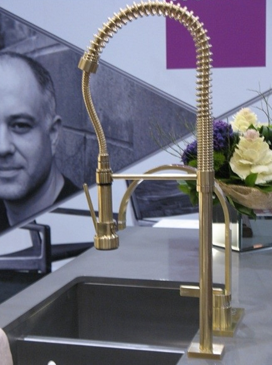
Seeing Rubinet’s R10 faucet at IDS in 2012 was one of the turning points for me in deciding to go all the way with brass and gold. I loved the unexpected look of the single faucet with the industrial sprayer in a warm metal instead of the ho-hum chrome, and the brushed finish made it less blingy and in your face.

Besides toning down the flash factor, I also chose to go with satin or antiqued brass finishes wherever possible instead of polished because the brushed and antiqued effect means fingerprints don’t show up as quickly as they would on a glossy surface- a great tip for a busy family kitchen!

image

For the cabinetry hardware, I mixed a timeless cup pull for all of the drawers with a simple round knob for all the cabinet doors. If you also love cup pulls but have drawers with any moulding, including the very popular shaker style I chose, make sure that you test the height of the cup pull with your drawer profile first to ensure it’s short enough to fit inside the borders. The classic cup pull from Classic Brass, which I special ordered through Gingers, just made the cut!

image

When it came to selecting more substantial appliance pulls for the refrigerator and freezer doors, I chose a complementary design from Baldwin, available at Antique Door and Hardware, also in a satin brass.

image

The same brushed brass can be seen on the range hood, a worthy splurge that helps pull the white and brass scheme all together and serves as a statement-making focal point. Made in Oakville by Custom Range Hoods, I went back and forth on the overall shape, finally deciding on this sloping model that fits tight to the ceiling. The brass striping really gives it that  Parisian bistro vibe that perfectly complements the backsplash tiles.


image


For the pendant lighting over the island,  the issue of ceiling height played a major factor, as I needed to select pendants that could be shortened to 2 feet tall and still keep their scale. I kept on going back and forth between a classic industrial pendant that had brass references and Visual Comfort’s iconic Hicks pendant, which also would have brought in a hit of black into the mix. I used the Hicks pendant in a previous project and loved it as the rivets fit the nautical theme perfectly, but decided to skip them for my forever home and go with a less trendy option, the yoke pendant.

next up:  furniture and the family room

(faucet image via Houzz, hood image by Stacey Brandford)

Tuesday, January 14, 2014

Puppy Chow

Who doesn’t love themselves a good old fashioned Staffordshire dog? And who doesn’t love a cookie?  Well those two delectable things unite in this whimsical cookie jar from Anthropologie that is so blatantly up my alley that I had multiple colleagues tag me on social media when they saw it in stores.

image

It would be pretty at home in my kitchen, but at $128 and considering I already have two pairs of Staf dogs on the main floor of the house, I may have to restrain myself for now.

Monday, January 13, 2014

Project Glam Kitchen: The Sink

My preference to stick with as much white and brass material as possible in my kitchen has been well documented in previous posts, and this mindset came into play again when it came to choosing my kitchen sink.

image

These days you can be pretty creative with your sink choices and go beyond your typical stainless steel, carving them out of the same solid surface as your countertop or choosing an interesting metal like hammered copper. (check out the buying guide on styleathome.com for a breakdown of more options and their pros and cons)

image

I decided to go with cast iron for its bright glossy white finish and because I knew it would be a durable material that would not chip or crack over time if purchased from the right company. What made my search for a cast iron sink a touch trickier was that I was looking for a sink that could be installed in a more contemporary undermount application, instead of the traditional country look that has an exposed apron.

image

I was also looking for a sink that had a partition of some sort in it so I could have two bowls to better organize clean up or stash some drying dishes or pots if I didn’t want them sitting out on the counter. The battle of a double versus single kitchen sink is a “divided” one in the design world but more often than not, the kitchens I have styled for the magazine go the single bowl route. Defenders of the single sink love their clean look and the fact that they can soak big pots and pans easily, which was also important to me, so I was hoping to find a good compromise.

image

Kohler’s Iron/Tones Smart Divide double-bowl kitchen sink was the perfect solution because it was not only made of durable cast iron with a lifetime warranty, but the size of the two bowls perfectly suited my needs, with the larger main bowl being big enough to easily soak a large pot and the smaller one being just the right size to hold other dishes or a smaller pot. The height of the divider is also not as tall as the sink itself, so you can fill the entire sink when required to soak a larger item that can then rest over the short partition.

image

The icing on the cake was the coordinating Kohler brushed gold drains that matched my faucet perfectly (I think unfortunately the brushed finish has since been discontinued, but polished brass and brushed bronze are still available.)

(Top photo: Stacey Brandford)

Friday, January 10, 2014

Project Glam Kitchen: Countertops and Backsplash

With my millwork and appliances selected came time to choose the hard finishes for the kitchen: the countertops and backsplash. I briefly debated adding a hit of black to the palette with honed nero assoluto counters, but instead decided to keep it warm, bright and white.

image

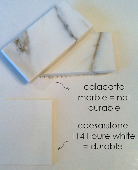
I had the beautiful golden veining of Calacatta Oro etched into my brain as the perfect choice for a feature stone and I was pleased to discover that Antica Tile and Stone made subway tile out of it, which looks amazing alongside the brass accents in the range hood. Having the marble subway tiles instead of using a modern solid marble slab gives the kitchen more of a bistro vibe, which I love.

image

Calacatta, while gorgeous, is not exactly hardy, so I wanted something tougher for my perimeter counters that would also be easy to maintain. Having worked with Caesarstone before on past projects, I automatically thought of their quartz, which comes in an array of colours and looks, from solids to patterns that make for extremely convincing natural stone-substitutes. For this particular project, I wanted a fresh solid white colour that wouldn’t fight with the veining in the backsplash, so I chose the crisp and clean 1141 Pure White.

edge profiles

Once you select a slab of Caesarstone, it is sent to your fabricator to be cut and finished like any other slab of natural stone. With a variety of edges available, I chose a simple straight edge that was clean and timeless. I debated a more decorative ogee edge, but decided against it considering how much easier it is to clean a straight edged surface (I hate when crumbs get caught on the outer edge of the ogee reveal)

olympia calacatta

To make the island a feature, I wanted a polished natural stone slab that would pick up on the backsplash with dramatic warm-toned veining. Natural stone varies from slab to slab, so it’s always a good idea to pick out your slab in person to make sure you’re getting exactly what you want. I had originally sourced slabs of Calacatta Manhattan Marble from Olympia Tile’s Slab Division, which was a budget-friendly alternative to regular Calacatta, but when it came time to select the slabs, the lot they had in the warehouse had pale green undertones, which would not work with my palette. This unfortunately meant upping the budget last minute to go for a premium Calacatta slab. Thankfully there was a very small slab available there with some beautiful golden highlights, which meant there would be little waste, and I could get the look I wanted after all without blowing the whole budget.

image

For the breakfast table, I knew I wanted something that I wouldn’t have to fuss over and that coordinated with the white and brass theme. I loved the idea of white painted wood with gilded details, but wood would be too easily damaged from hot plates and scratches, not to mention super pricey, so I kept on searching. Luckily I found an amazing mid-century vintage brass cage table base at Patina Antiques so now I just needed to pick the perfect tabletop. A glass tabletop would mean endless hours of windexing off sticky fingerprints, plus the extra cost for starfire-glass which would avoid the green edges that I’m not fond of, so I kept looking. A fabulous and practical solution was to have another slab of the pure white Caesarstone fashioned into the top. This way I could template the table base so it would be the perfect proportion, and size it exactly to the banquette. It turned out perfectly!

up next: the sink

(Breakfast table shot: Stacey Brandford)

Wednesday, January 8, 2014

Project Glam Kitchen: Millwork

I looked into big-box cabinetry options for the kitchen millwork, but after not being able to find a shaker door style and finish that I loved as well as not loving the idea of being confined to standard sizes only (which lost us a lot of precious inches in our apartment kitchen) I decided to go the custom route. With their stellar reputation for service and endless customization options, I chose to work with Cameo Kitchens and Fine Cabinetry.

I had a great time touring the showroom on Lawrence, where it was very helpful to see all of the different interior storage options, look at different layouts and door finishes and touch and feel how the hinges and drawers felt. As an avid cook and entertainer, I enjoyed having so many choices at my fingertips that catered to my needs and loved working with Gita, a personal kitchen designer who would translate my plans into actual shop drawings.


cameo- door profiles

We started with a frameless kitchen construction, which was more wallet-friendly than a more labour-intensive framed kitchen, and chose a classic shaker profile for the doors that wasn’t too fussy. Having the millwork sprayed in Benjamin Moore Cloud White keeps the traditional look fresh and timeless.


A crown moulding detail between the upper cabinets and bulkhead and a nice valance below add polish and detail to the cabinetry. A valance underneath your uppers is always a great idea if you’re going to have under-cabinet lighting, as the depth of the decorative moulding can hide puck lights or LEDs quite well.

island baseboard- SAH
Another millwork detail that made a huge difference was a baseboard profile on the island as opposed to a plain toe kick. This truly makes the island look like a finished piece of furniture and I’m so glad we added that upgrade, considering the profile of the island is the first view you get when you walk into the kitchen.


Drawers are always the most efficient form of storage in a kitchen as opposed to cupboards with shelving, so we included three banks of them, as well as two drawers under the cooktop (a narrow one for pans and a taller one for pots).


cameo- pantry

It was great to see all the various pantry storage options. I chose simple wood pull outs in the end so I could reach everything easily and have the most flexibility in how I stored everything.


Custom inserts keep utensils and cutlery well organized and at the ready when whipping up a meal and setting the table, and a LeMans system in the single corner allowed me to corral a lot of small appliances into a tight space.


cameo- waste management

My husband is keen on green, which means having a waste management area to properly sort our garbage, recycling and organic waste was paramount. With a handy drawer above the garbage and green bin, new trash and recycling bags are always at the ready. We didn’t go with this exact version but it was great to see all the possible configurations.


up next: countertops and backsplash

Tuesday, January 7, 2014

Project Glam Kitchen On Newsstands Now!

image

Look for the full spread in the February issue of Style At Home and keep checking back here and on the Style At Home blog for more behind the scenes posts on how it all came together!

waks kitchen

image

(photos: Stacey Brandford)

Monday, January 6, 2014

Project Glam Kitchen: Appliances

Before finalizing any layouts and millwork drawings for my kitchen, I was busy researching appliances. Selecting appliances well in advance allows you to plan your kitchen efficiently, knowing all the factors you need to accommodate beforehand.

When it came to selecting brands for my kitchen, I started with companies that had an excellent reputation for quality and service with a professional restaurant look. A lot of appliances these days aren’t made the way they used to be, and I wasn't interested in anything that would need replacing 5-10 years down the road. This reno was all about longevity and investing in long-term reliability so I was prepared to set aside a big chunk of the budget for them.

panelled vs stainless- SAH

Another reason I started looking at higher-end brands, was because they afforded the most options for built-in and panels for a truly seamless look. I knew my colour scheme was going to be white and brass based, and wanted to minimize the amount of stainless steel in the kitchen so panelling was a great solution.

I did debate looking at companies that made white appliances instead of going the panelled route to solve the stainless steel issue, but most of them were too modern looking for my tastes and skewed a little blue in their undertones. I was also advised that because white is not a standard finish for high-end brands and is more of a trend than a staple, that replacement parts would not always be readily available 15-20 years down the road if something needed repair. Because this reno was all about the long-term, we decided to stick with panelling route to be safe.

water dispenser in fridge- SAH

Having grown up with a Sub-Zero fridge in my parents’ home that lasted over 25 years, I automatically looked to them for refrigeration. Their stellar reputation and wide array of models was a worthy investment for us. I was ecstatic to discover one of their latest built-in side by side fridge models with a filtered water dispenser inside, which sealed the deal! Because I wanted a nice traditional panelled look and have a husband-induced ban in the house on bottled water, I loved how I could still have the convenience of cold filtered water and ice at the ready, but have it concealed inside the fridge and not sticking out in the middle of the door panel.

bar fridge- SAH

I also put in the same undercounter beverage centre that my parents had also put in their last remodel - perfect for storing wine bottles, juice boxes, beer and more- super handy when you like to host as much as I do!

image

When it came to cooktops and ranges, I needed something heavy duty with at least five burners and it needed to be gas. I hated the electric cooktop in my old apartment and personally don’t love working with induction either, so I had my heart set on the immediate control of a gas flame. After getting mixed reviews on a couple other brands of professional-style ranges, I looked to Wolf. Another reason I went with Wolf is because purchasing Sub-Zero and wolf products together in bundles would save us some money due to them being owned by the same company, plus I also must admit those signature red knobs were quite a draw for me too! Going with a 36” six-burner sealed cooktop allows me to move multiple pots and pans easily across the range, from a huge stockpot of chicken soup to an Italian feast with different types of pasta and sauces all going at once! Going with a cooktop also freed up convenient storage for pans and pots in the drawers beneath.

tower of power- SAH

Stacking double ovens and a warming drawer in a single tower of power also allowed me to tackle multiple dishes at once and keep things warm and at-the -ready before serving.

A dishwasher from Miele that was delicate enough to handle my crystal and a microwave drawer from Tasco completed the list of appliances, giving me all the tools I needed to cook up complicated meals! Going from very builder basic to beautiful chef-style appliances has made cooking such a pleasure and I just love putting them to good use, cooking tons of different dishes to feed a crowd!

next up: millwork

Saturday, January 4, 2014

Baby Buy: Bowtie Bib

With the twins’ arrival getting closer each day, I have been paying more and more attention to baby gear and clothing. Buying for boys is a whole new world for me so I get really excited when I find testosterone-friendly apparel that’s in line with my own tastes.

image

One such find is this adorable bib by Mally Designs that I spotted at the One Of A Kind Christmas Show. Made in Canada of soft washable leather, it makes high-chair time into a chic affair thanks to the sophisticated black and white bow tie design.

image

Starting at $35 it’s not cheap and I was hesitant about its functionality, but apparently the pocket does extend enough, and stains do easily come out. Bonus for identical twin mommas like me, it can be monogrammed too so you never feed the same twin twice!

Friday, January 3, 2014

Project Glam Kitchen: The Layout

After determining the confines of space I had to work with, I did tons of research, pouring over back issues of Style At Home and revisiting my interior decorating course notes on kitchen planning so I could map out the kitchen of my dreams. I love to cook and entertain so it had to be extremely functional and not just stylish.

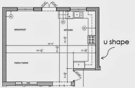
old kitchen layout- SAH

When I looked at the shell of the kitchen, the given elements to work with were: two corners, an island, and a nice large window to place the sink under. After some helpful advice from my former boss, architect Dee Dee Taylor Eustace, I was convinced to remove cabinetry I had initially placed on the shorter wall right by the entrance to the addition so the kitchen would be an L shape and not a U shape. This was great advice because in kitchen planning, corners are the most inefficient use of space, so losing that shorter wall was not a big storage loss. As a result my island could be increased by two feet- valuable square footage when spreading out a buffet for 20!

kitchen plan- SAH

As the main focal point, I’m all about symmetry, so it was a no brainer to centre the cooktop and range hood on the island. I kept the other cooking appliances close by and placed the tower of power (the stacked double ovens and warming drawer) against the shorter wall.

kitchen elevation 1- SAH

I debated a bar sink in the island, but after choosing a large main sink with divided bowls, I realized that an uninterrupted surface for serving and prep on the island was more important to me than a second place to wash up. What I did put in the island, is a great waste management zone for our garbage, green bin and recycling, as well as a microwave drawer and bar fridge.

The main fridge needed to be close to the sink, so it was placed to the left, adjacent to the dishwasher. Gita, the kitchen designer I worked with at Cameo Kitchens and Fine Cabinetry assured me it would be okay to have the dishwasher to the left of the sink and not the right, contrary to what I had been instructed in my kitchen design classes, and I’m so glad I listened to her sage advice as that decision freed up space for banks of drawers on either side of the cooktop. A pantry to the left of the sink finishes off that wall.

kitchen elevation 2- SAH

A big back and forth I struggled with was the amount of upper cabinets. A big trend right now is to have as little uppers as possible in favour of some open shelving, but I wanted to max out storage and have the option to hide away clutter.

Due to some surprises with final site measurements, I was advised by my design department colleagues to ditch the glass-fronted uppers I had planned on either side of the window above the sink for glassware. Thank goodness I took their sage advice as these cabinets would have been far too skinny and having some breathing room on either side of the window lets the marble backsplash shine! I also left about a foot of space on either side of the range hood and carried the marble backsplash all the way up to achieve the same effect.

Up next: appliances