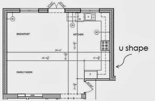
After determining the confines of space I had to work with, I did tons of research, pouring over back issues of Style At Home and revisiting my interior decorating course notes on kitchen planning so I could map out the kitchen of my dreams. I love to cook and entertain so it had to be extremely functional and not just stylish.
When I looked at the shell of the kitchen, the given elements to work with were: two corners, an island, and a nice large window to place the sink under. After some helpful advice from my former boss, architect Dee Dee Taylor Eustace, I was convinced to remove cabinetry I had initially placed on the shorter wall right by the entrance to the addition so the kitchen would be an L shape and not a U shape. This was great advice because in kitchen planning, corners are the most inefficient use of space, so losing that shorter wall was not a big storage loss. As a result my island could be increased by two feet- valuable square footage when spreading out a buffet for 20!
As the main focal point, I’m all about symmetry, so it was a no brainer to centre the cooktop and range hood on the island. I kept the other cooking appliances close by and placed the tower of power (the stacked double ovens and warming drawer) against the shorter wall.
I debated a bar sink in the island, but after choosing a large main sink with divided bowls, I realized that an uninterrupted surface for serving and prep on the island was more important to me than a second place to wash up. What I did put in the island, is a great waste management zone for our garbage, green bin and recycling, as well as a microwave drawer and bar fridge.
The main fridge needed to be close to the sink, so it was placed to the left, adjacent to the dishwasher. Gita, the kitchen designer I worked with at Cameo Kitchens and Fine Cabinetry assured me it would be okay to have the dishwasher to the left of the sink and not the right, contrary to what I had been instructed in my kitchen design classes, and I’m so glad I listened to her sage advice as that decision freed up space for banks of drawers on either side of the cooktop. A pantry to the left of the sink finishes off that wall.
A big back and forth I struggled with was the amount of upper cabinets. A big trend right now is to have as little uppers as possible in favour of some open shelving, but I wanted to max out storage and have the option to hide away clutter.
Due to some surprises with final site measurements, I was advised by my design department colleagues to ditch the glass-fronted uppers I had planned on either side of the window above the sink for glassware. Thank goodness I took their sage advice as these cabinets would have been far too skinny and having some breathing room on either side of the window lets the marble backsplash shine! I also left about a foot of space on either side of the range hood and carried the marble backsplash all the way up to achieve the same effect.
Up next: appliances


No comments:
Post a Comment