Thursday, March 27, 2014

A Chic Retreat: My Master Bedroom

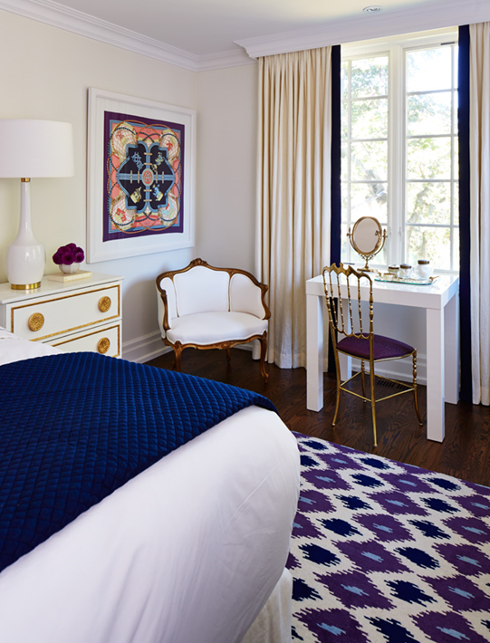
The master bedroom was part of our second floor addition, and while it’s not a huge space, it more than serves its purpose as a luxurious room to relax and rejuvenate in with a king size bed, small vanity and a bank of dressers for tons of clothing storage.

image

I’ve always been on board with calming fluffy white bedrooms, but I decided to shake it up by introducing a major statement rug and some other attention-getting accents. The result is still a very restful space, but the bold hit of pattern and colour give it more personality.

master- scarf

I needed a palette that would be grounding and not too feminine, and I found my unlikely colour combination  inspiration in this dreamy Grand Tenue Hermès silk scarf which features my favourite regal violet, classic navy and a cheerful sky blue.

master- rug preview

I took the colour inspiration to ELTE where it was translated into a custom ikat rug.  The three colours are so vibrant and I love the eclectic ethnic vibe it adds to the space.  The making of the custom rug was such an interesting process, that I’m going to be chronicling how it came together in a separate post later this weekend so stay tuned for that.

image

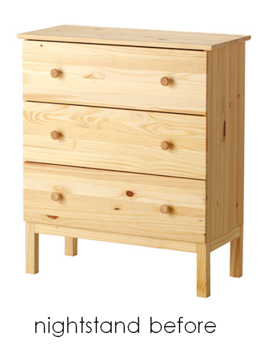
The nightstands were the result of an IKEA tarva hack us design editors did for a special makeover issue of Style At Home. After all that gold leafing, I knew I wanted to enjoy the fruits of my labour past the shoot, so I cut down the legs by a few inches so they would sit at a more bed-friendly height. I love all the extra storage it provides but I am, however,  not in love with how the drawers glide (they’re always getting stuck), so one day hopefully they can be replaced with the inspiration behind the hack: Suzanne Kasler’s tuxedo chests in a creamy ivory lacquer.image

Because the headboard was so tall, I wanted lamps with presence. The Nola lamps by Mitchell Gold + Bob Williams that I picked up at ELTE were a perfect fit with their elongated base and gold accents, which tied them to the nightstands perfectly. 

For the headboard, I went with the tall upholstered Milano from Barrymore Furniture with simple clean lines and three rows of button tufting. I used a creamy ivory linen, Fabricut’s Brother in Snow, which complements the warmer ivory tones of the wool carpet. I chose a headboard only, as opposed to an upholstered bed frame, because I like having access under the bed. In order to give that same finished look as a platform bed, I had Cooper Bros. sew a custom bedskirt in the same linen – a great cost-savings trick that can also be sent out for cleaning if needed.

Scallop

For the bedding, I visited my favourite linens boutique in Toronto, Au Lit Fine Linens. I have always loved the hotel look, with a graphic banding detail, but for extra pizzazz, I decided to go with their scallop design. Outlined in navy as opposed to a more girly colour, it tones down the frill factor while still looking very refined.

image

Even though the headboard and drapery fabric is a warmer ivory, I decided to go with classic white sheets instead of matching it directly to the headboard. The cream was beautiful, but white is a total classic that you can’t go wrong with, and custom king size bedding is an investment that you want to ensure will work for you over time! If you’re into beautiful beds like me, be sure to check out my “in bed with” post on the Au Lit Blog for more

master- blue mu

To top off the scalloped bedding, I chose a single rectangular Madeline Weinrib cushion in her Blue Mu fabric to echo the ikat rug. A rich navy diamond matelassé coverlet folded at the end of the bed is the final punctuation of colour and completes the bed beautifully.

image

In addition to sewing the bedskirt, Cooper Bros. were also responsible for updating my grandmother’s antique tub chair with a slick new upholstery job. Recovered in Maxwell’s platinum vinyl in pearl, it looks totally fresh and even more importantly, will stand up to wear and tear.

image

The same Fabricut linen as the headboard and bedskirt is used for the blackout lined drapery panels. To bring in a hit of navy, the leading edge of the drapery panels have a wide grosgrain ribbon from Mokuba sewn on. In order for the crown moulding to run uninterrupted across the window (which was specified too large to fit under the moulding ), a plaster valance box was created for one seamless line. The drapery hardware runs underneath on a track, and the result is not only functional but looks very finished as well.

master- chiavari chair

I wanted to pair something traditional with the modern parsons vanity it for some tension and to help tie it to the rest of the house’s gilded accents, so I looked for beautiful vintage options in Miami, I came across pairs of these solid brass bamboo and chiavari chairs. I’ve always loved the classic chiavari design, plus they were already upholstered in purple so it was meant to be!

Tuesday, March 25, 2014

Baby Buy: Carlymegan Love You Forever Blanket

I found out about this beautiful blanket in the most delightful way: a pair of them was gifted to me for my boys – lucky Jack and Charlie!  Made from organic cotton knit by carlymegan, the lightweight and super soft blanket spells out the famous words: “"I'll love you forever, I'll like you always, as long as I'm living, my baby you'll be,” in graphic black and white with little heart accents.

image

Obviously like any other red-blooded human, the book “Love You Forever” holds a near and dear place in my heart – even more so now that I am a mommy myself – and as you know I also adore black and white, so these were practically made for me!

The blankets appear to be sold out for now, but check out carlymegan’s site for other adorable handmade baby items, like her amazing PJs!

Friday, March 21, 2014

My Puuuurfectly Glamorous Powder Room

Ah the powder room. The one space in the home where you can go buck wild with your design scheme. It’s usually isolated enough from the rest of the house’s principal spaces, either tucked into a nook or at the end of the hallway, and is often light-locked without any windows. This small bathroom is  just begging for some wallpaper or a snazzy vanity, so it took me months to narrow down my options and finally decide on how to jazz up my own.

image

Those who know me are well aware I have an affinity for leopard, cheetah, ocelot and even tiger prints.  Basically any exotic cat is fair game for me when it comes to choosing patterns for interiors or fashion, so that’s why I chose Thiabut’s Tanzania for my wallpaper, which is a decorator classic.

image

It was a very close call though with another wallpaper pattern: Hermès’ Equateur, which has a leopard at the centre but also a host of other wild creatures, including a SLOTH! Of course being Hermès, it is a small fortune, so I considered installing the same wainscoting profile as in the foyer so I’d need less yardage, but in the end I still couldn’t swing it so Tanzania it was! I also considered Fornasetti tiles at one point, which also are not exactly budget-friendly, but that’s another story for another post…

powder room- vanity

Because the powder room is guest-oriented and only has to function as a simple two-piece, you have the luxury of a vanity that follows form more than function. I have always loved the washstand look which is high on style but low on storage, so the powder room seemed to be the perfect place to install one. I wanted it to feel retro and glamorous, so I went with a polished brass version from Canaroma with elegant tapered feet.

image

For a sleek look, I chose the rectangular Kathryn undermount sink from Kohler, which complements the clean lines of the vanity legs. Because the underside of the vanity is exposed, I needed a sink with a glazed bottom and this elegant model fit the bill. 

image

I wanted a feature faucet in the same warm metal finish as the vanity, so I chose the geometric Hexis by Rubinet. It has an edgy glam vibe that  I love, which is also repeated in the coordinating paper holder. I went with Rubinet because they also sell brass and gold decorative p-traps and the other pretty exposed plumbing elements you need with a washstand vanity, so I was happy to know the vanity would look beautiful and finished from all angles.

powder room- tp

Speaking of TP, you may or may not be wondering where I have extra rolls stashed for guest considering there is nowhere to hide it in the vanity… Well can you imagine that a polished brass basket actually exists for such things? I know there are plenty of toilet paper holders with storage underneath out there, but because I already had a wall-mounted paper holder, all I needed was the extra roll storage, so I was pleased to find a brass one actually existed.

powder room- mirror

The star attraction of the powder room is Vivian, the malachite mirror from Made Goods. It’s a simple rectangular frame, but the emerald tones of the real malachite stone shimmer and pop against the neutral wallpaper in such a magical way. It borders on ridiculous how gorgeous it is in person and it coordinates perfectly with my art deco malachite glass vase from my grandmother and malachite dish I bought in South Africa a few years ago.

image

The vintage lightning bolt sconces were another obsession of mine that I admired over a two-year period every time I visited Residential Lighting. I loved their wacky mid-century style so after wavering over them for two years,  I bit the bullet and made them mine. The ceiling height is very low in the powder room, so I needed to find a knockout flushmount and I liked how the Sophia from Circa Lighting added to the celestial vibe of the sconces. I even painted the ceiling in Selectone Paint’s black deco to make it feel like a star shining in the night sky. The black ceiling also mirrors the black nero assoluto floor tiles from Marble Granite Depot.

powder room- kassatlys

Last but not least, no powder room is complete without luxurious guest towels, so while in Palm Beach last spring, I ordered a pair of custom Leopard embroidered towels from Kassatly’s on Worth. It was so much fun selecting the thread colours to match my scheme (I of course picked malachite-coloured thread for the grass) and they are such a special finishing touch.

(powder room image by Stacey Brandford)

Wednesday, March 19, 2014

New Wardrobe Alert: Mossimo Lounge Pants

I knew the recovery from a C section wasn’t going to be all rainbows and flowers, but I was so unprepared for the deflated balloon feeling I’m experiencing with my stomach. I realize having twins pushed my stomach to its limit but holy hell (warning: mom anatomy terminology ahead!) my uterus is still so swollen and painful, making fitting into any pre-maternity pants a pipe dream. This means the only pants I’m wearing these days are sweats and leggings that don’t irritate either my now empty womb/incision and leftover maternity pants- wooo!


image

Considering my fashion limitations, I was very pleased to receive a pair of these Mossimo sweats from my sister, which have a more refined lounge vibe to them as opposed to the bulkier versions of sweats that I often sport. I went up a size to ensure nothing was to snug on my tender stomach and although I still look like I’m 5 months pregnant, I at least feel a little less hefty in these sleeker sweats. And for less than $25 a pop, I bought another pair for myself in black!

Tuesday, March 18, 2014

Den Before and After

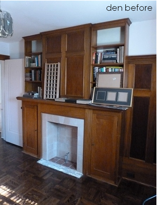
When we toured our home, I loved the small den tucked away above the garage (or as my husband calls it, “the lions den.”) It’s not large by any means, but we were enticed by the idea of having a little refuge off of the master bedroom for watching TV and having some quiet time. I viewed it as a great little bonus space on the second floor and was excited to transform it into a soothing oasis.

image

The panelling was in good shape and I loved the parquet floor, but unfortunately everything had to be ripped out to accommodate new insulation for the exterior walls and new ducting and a new subfloor. I was sad to see the character go as we updated the structure, but was determined to reinstate that same vintage vibe - but this time with a modern edge!

image

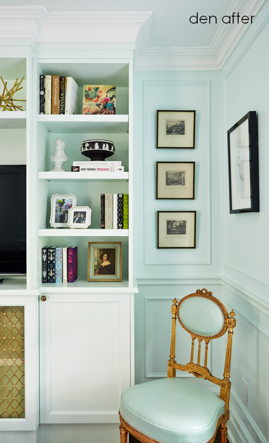
I achieved this eclectic vintage look by installing applied panel moulding to the walls and painting it out in a surprising soft mint colour: Benjamin Moore Irish Mint 2041-70. Both the trim and walls are in a satin finish, so it looks rich and creamy and totally soothing.

den- fabrics

I paired the mint with a dreamy lilac, which reminded me of a colour combo you’d see inside a Parisian patisserie, but set it off with crisp black and white to keep it from feeling too girly girl. The monochromatic art on the walls varies from a reproduction poster to an ink drawing my dad did in the 70s to a tear out from an Hermes catalogue. The lavender flatweave rug by Madeline Weinrib was a lucky score at a sample sale at Y&Co and ended up being the perfect size for the small room.

image

The success of this unsual colour combo of mint, lavender and black and white works thanks to the fabric that ties it all together: Manuel Canovas’s Dara in torquoise. I have been obsessed with this fabric since I first laid eyes on it in Primavera’s showroom in Designer’s Walk. It’s just bananas. I used it for the accent cushions and trimmed them in black fringe from Designer Fabrics for a classic decorator detail.den- sofa

For the sofa, I used Robet Allen’s Orvis in black, which is a rich herringbone woven that complements the tailoured lines of the piece perfectly. It was a challenge finding seating with a narrow enough depth for the tight space, but Barrymore’s Gatwick two-seater made the cut at 34” deep . I customized it with a band of white grosgrain ribbon from Mokuba on the skirt and know that the classic shape and compact size will make it a piece I’ll have in my home for years to come.

image

To punctuate the black and white elements, I used another textile I had been lusting after, this time from Telio’s beautiful showroom. Jim Thompson’s Erminia, a sheer from The Tony Duquette collection that looks like the ermine trim you’d see on a king’s cape in fairy tales, was a perfect choice for tailoured roman shades.

image

I didn’t have room for a conventional coffee table so I had to think outside the box. West Elm’s hex marble tables had the geometric shape that I loved, and they could be pulled together or apart to allow for optimum flow in such a small space. Only catch: I was not into the aluminum frame. Enter Amaco’s rub’n’buff, which I special ordered from an art supply store. After some well-ventilated elbow grease sessions with a pile of shmatas, my table bases were now a burnished gold, which looks ever so elegant with the carrera marble tops!

image

The beautiful antique gilded chair in the corner was a treasure I schlepped back from the Brimfield Show trip I took with my fellow editors in the spring of 2012. The chair was just too special to leave behind, even with little bits of carvings missing and the worn down finish. I decided to reupholster it in leather after stumbling upon a remnant of a hide in a delicious mint at Designer Fabrics. The remnant was just big enough to cover the back and seat and I love the way the pastel pops against the luxe gold frame. The frame is so unique that I can see it holding its own in any corner of the house because it’s just that pretty.

image

The original den also had a narrow built-in unit with an electric fireplace. I’m not really into electric fireplaces (this pyro needs a real flame!) and because of the small size of the room, any actual heat source was ruled out in order to keep it from turning into a sweatbox. The uselessness of the fireplace combined with the lack of depth to fit a cable box led us to start from scratch.

image

I designed a new paint-grade built-in to house the TV as well display books and tchotchkes above, with hidden storage below. A favourite vintage oil painting I found in my grandparent’s basement, my first piece of original abstract art by Team Macho and a piece of Wedgwood black  jasperware all mingle on the open shelves and reinforce the palette even more.

image

I needed a mesh inset in the lower doors of the built-in to allow the signal of the remote to travel to the cable box, and splurged on this gorgeous diamond grille from Ginger’s with a rosette detail – the jewelery of the room! This detail along with the other warm metals in the room, including the vintage light fixture from Around the Block, complete the decadent mood of this enchanting little room.

(after photos by Stacey Brandford)

Friday, March 14, 2014

A Closer Look at the Dining Room Wallpaper

My striking dining room owes its wow-factor to the stunning hand painted Chinese wallpaper and gold-leafed ceiling that envelopes visitors with its jewel box effect.

LORES-2013-1009-STYLE-5052

I’ve always been a hard core fan of Chinoiserie design and have admired the handiwork of  companies like Gracie and De Gournay, but my passion for this type of wallpaper was cemented when I visited Rough Point, the estate of Doris Duke in Newport. Her music room had antique panels of Chinese wallpaper she had purchased at auction and it left such a magnificent and regal impression on me. (you can read about it in this blog post I wrote almost 3 years ago- you can’t say I’m not consistent!)

dining room- wallpaper meeting

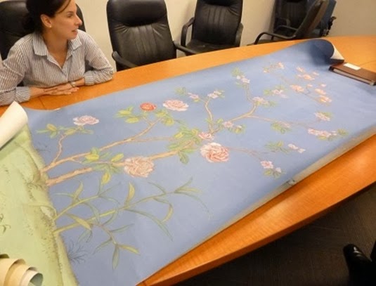
With my enduring passion for this type of wallpaper, I was very happy to stumble upon the work of Griffin and Wong a couple of years ago, whose sales operations is based right here in Canada in Vancouver. The design department of Style At Home was lucky enough to view a presentation from Douglas Bray and I fell even more in love with how the delicate illustrations shimmered right off the silky paper.

dining room- paper

After perusing Griffin and Wong’s 24 Chinoiserie patterns, I chose Du Paqier, a delicate motif containing mostly blooming cherry and magnolia trees with some birds and butterflies. I requested that the birds and butterflies be toned down in favour of more flowers so the impression was more blooming garden and less nature reserve.

image

I knew I wanted a soft aquamarine background to complement the similar colour of the Angelica mirror above the adjoining living room mantel, and for the main blooms I also colour-matched two accent textiles from the living room: the pinky-lavendar mohair in the flair chair and hot and pale pinks in the Madeline Weinrib lumbar cushions. The wallpaper also contains dashes of the blue of my formal china: Bernardaud’s Elysee.

dining room- wallpaper 2

The design truly was a collaborative effort, with photos of the process being shared with me along the way to ensure the correct colour balance was being achieved.

dining room- wallpaper

Seeing photos of the artisans at work makes me appreciate the beauty and craftsmanship behind each panel every time I am in the room. It also emphasizes the truly bespoke factor of the paper and appeals to the luxury lover in me!

LORES-2013-1009-STYLE-5025

The crowning jewel of the dining room is the gold leafed ceiling. It looks like it was applied by hand when it is in fact another wallpaper from Griffin and Wong. This dazzling gilded effect was not just an aesthetic choice.  It was also installed to help deflect from the fact that the ceiling height is dropped 2 inches more than the adjoining living room due to a structural beam. The warm metallic ceiling bathes the room in a soft glow, flattering guests and creating a warm festive mood which is the cherry on top of this fabulous space!

(top wallpaper detail and dining room photo by Stacey Brandford)

Thursday, March 13, 2014

I Want That: Heart Art

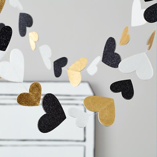
Heartstring Garland

I know this is a garland on a children’s website, but my gosh I think they designed it for me! In my signature trio of black white and gold, I just love the festive feeling of these strings of  hearts and may need to buy a couple for a future soiree!

Find it here: Heartstring Garland, $29, Land of Nod

Wednesday, March 12, 2014

Dining Room Before and After

One of the most dramatic transformations in my home was my dining room, thanks in large part to to the eye-catching Chinese hand painted wallpaper from Griffin and Wong. I’ll be going into more depth on the paper later this week, so for now let’s look at the furniture and lighting.
image
The original dining room in the house had lovely wainscoting with built-in cupboards on either side of the windows. There was also an arched niche in the centre of the room that could fit a hutch. All together the room was a decent size, but with my visions of entertaining large groups (my immediate family alone is double digits), we decided to add three feet to the room as part of the addition. That bonus length combined with removing the built-in’s allowed for a table that could sit twelve when extended. It also made room for a server, so with these main pieces space planned, I set out sourcing the perfect dining table and chairs, server and hutch.
image
I hunted down antique and vintage tables and chairs for months, but ultimately I realized it would be nearly impossible to find such a large antique table and suite of chairs that were in my price range. After resigning myself to shopping for new pieces, I was delighted to discover Carrocel Restorations not only fixed up old pieces in need of some love as their name implied, but also did a beautiful job custom finishing and upholstering reproductions that they stock.

image
I have always loved the classic silhouettes of traditional Louis chairs. I had previously had the more frou-frou curvy Louis XV in my apartment, so this time I wanted a chair with more restrained lines to let the fanciful wallpaper shine. Also in terms of investing in a set of twelve, I  liked how the straight lines of the Louis XVI chair feel traditional, but can be more easily modernized with a dark finish and solid neutral upholstery.
image
I of course usually am not one to go with anything too subdued, so I had Carrocel finish the chair frames in creamy antiqued ivory with gold leaf accents. For contrast and drama, I chose aubergine fabric, which is one of my favourite colours of all time. I wanted a buttery leather that would crackle and patina over time, but real hide was too cost-prohibitive so I went with a vinyl. I chose Kravet’s valera in currant, which looks like the real thing at a fraction of the cost. The seats are finished off perfectly with brass nailheads on the base adding a second accent of warm metal.
image
Because I invested in the chairs and wallpaper, I needed a simple more-budget friendly table. Carrocel offered a classic Duncan Phyfe pedestal table with minimal detailing that was in my price range that they custom stained for me in a rich walnut colour. I would have loved a table with a graphic  banding detail on the perimeter, but considering I knew the table would be covered up with a cloth most of the time when entertaining, I knew it was the right decision to go with this more basic top.
dining room- carrocel table grain
The top is veneered in mahoganny, which has a beautiful highlighted grain. The pair of solid beechwood pedestals are fluted and complement the Louis XVI chair’s carvings. The final touch are the brass lion paw caps which add a dash of glam underfoot.
image
Next up were pieces for serving and storage as well as the only wall decor element in the entire room: a mirror (who needs art when the whole room is covered in hand painted wallpaper!) I have a lot of china, flatware and stemware and needed a place to store it.  The mirror above the server and Queen Anne hutch that sits in the niche were hand-me-downs from my parents, and I love how their arched cut-out tops echo the chinoiserie motif of the paper. 
image
For the server, I lucked out at Of Things Past, where I found this preloved gem. The fluting in the legs was a perfect fit for the chairs, but even more incredibly, it had an onyx top that was the same colour as the wallpaper background! Talk about a score!
image
Refinished by Carrocel in the same stain as the dining table, it looks incredible but is also functional, thanks to its heat and moisture resistant stone top and felt-lined drawer which stores my silverware. The brown veining in the onyx highlights the deeper wood tone, which is a vast improvement from the original honey stain. The mirror was also  given a new look by Beresford Inc. with a coating of the same creamy paint on the dining chairs to balance the rest of the wood in the room.
dining room- light
When it comes to lighting, you can never go wrong with traditional crystal chandeliers and sconces. They’re eternally elegant and instantly make a room feel more sophisticated and glamorous. Although I love my antique fixture that I found at a great price from Akladios Antiques, I’d be remiss if I didn’t show you the fixture that dreams are made of:
image
The Metropolitan series by Lobmeyr is enough to make any decor-enthusiast go weak in the knees. Made for the NYC Opera House in 1966 which gives the fixture its name, I love its elegant elongated sputnik with just the right sprinkling of crystals. It’s less severe than the current Adler design (which is still fab, don’t get me wrong) but unfortunately is sooooo not in my price range so I went the more traditional chandelier route. My chandelier has a few mismatched crystals, but was the perfect size and scale for the table. One day I may add some shades to the lights, but for now it totally works!
(after photos by Stacey Brandford)