The latest bookazine from Style At Home is all about makeovers and it's a goodie! Chock full of dramatic before and afters, there is page after page of inspirational images that will get your creative juices flowing and ready to tackle your next project.
My master ensuite, which we worked on as part of our big reno last year, is featured and it shows how we transformed a tiny cramped bath into a sophisticated and relaxing retreat.
Categorizing it as a makeover is an understatement because literally nothing remains from the original space. The bathroom was teensy and poorly laid out with a wee wall-mounted sink, toilet and narrow tub/shower. Thanks to walls that jutted out awkwardly to accommodate two separate closets on each end, it was a very weird shape and there was no way the bathroom could be used comfortably for more than one person at a time.
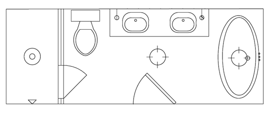
We opened up and lengthened the space into a long rectangle by demolishing the two closets and borrowing some extra feet from a nearby bedroom. The plumbing was reconfigured to accommodate a double vanity, large shower and separate bath tub for a luxurious master ensuite retreat.
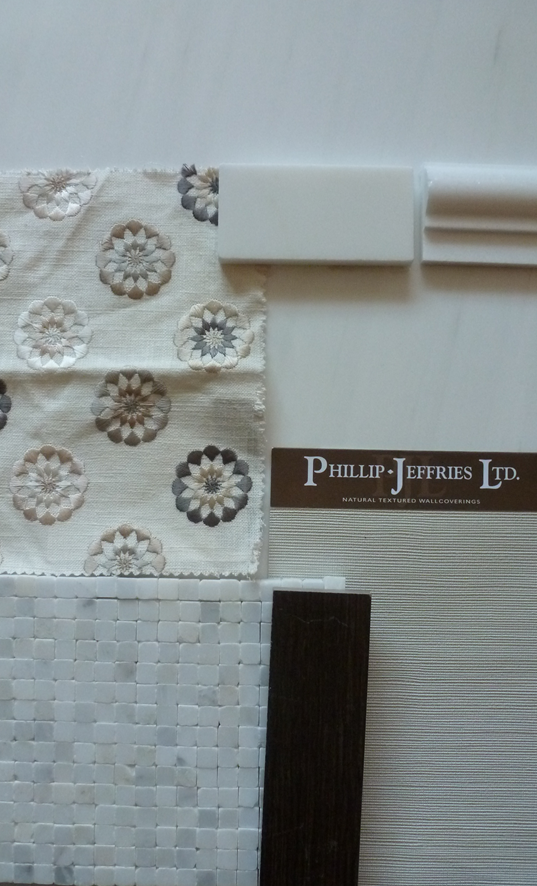
I wanted the space to feel like a properly appointed salon and not a regular old bathroom, so I brought in details you’d see in a living room, including textured wallpaper, a chair rail, and herringbone floors for a richer atmosphere. I reinterpreted these elements in bathroom-friendly materials, such as Philip Jeffries’ vinyl glam grass for the wallpaper from Crown Wallpaper, marble for the chair rail, and porcelain tiles for the floor.
I used a timeless palette of whites and cream stones from Marble Granite Depot, paired with the rich walnut tones of the faux-wood tiles from Stone Tile. All these colours are seen in the roman shade fabric, a small scale embroidered pattern from Crown Wallpaper & Fabrics that ties it all together beautifully.
The plumbing fixtures are classic and refined with cross handle details. I mixed Brizo’s Tresa lavatory faucet for the vanities with the luxurious Raincan shower head and Charlotte slide bar with shower. Having the relaxing large rain shower head is a real treat, but having a removable shower head is just as key when it comes to ease of cleaning so I am loving the combo of the two!
Brizo doesn’t make a deck mounted telephone style tub filler, but Rubinet has a wonderful selection of tub fillers, so I chose their Raven design which complements the other faucets nicely. The various fixtures are united in a warm polished nickel finish which plays off the rich tones of the floor tile and colours in the roman shade. I was even able to order the legs of the Cheviott clawfoot tub from Vintage Tub & Bath in polished nickel as well for a truly cohesive look.
I love how the refined vintage vibe of the bathroom is an extension of the rest of my home’s décor. The dramatic clawfoot tub, framed antique prints and pleated shades on the beautiful Payson sconces from Circa Lighting reinforce a warm and glamorous mood that makes getting ready in the morning a pleasure.
Seeing the bathroom come together on the page is very rewarding considering it was probably one of the most complicated spaces to deal with during the entire reno. So much can go wrong in any given project, but this bathroom took us to a whole other level of insanity! There were extreme variations in the natural stone mosaic I selected for the shower which meant that part of the shower walls had to be ripped out and new tile sourced at the eleventh hour, the tub filler ended up being too deep for the tub and had to be shortened which took weeks, two separate parts of the tub were missing and caused delays until each one was received and could be hooked up, a wallpaper mix-up, the list goes on…you name it and it probably went wrong or delayed us! I’m justso happy it’s done and that I get to enjoy it every day!


2 comments:
Dear Jessica,
I am interested in cooperation with your blog. Unfortunatelly, I was not able to find your email on the site. If you could send me your email address at cooperation@the-artwork-factory.com, I would greatly appreciate it!
Thanks,
Eliška
I love your floor, it's really embedded by the white everywhere !
Lisa
Post a Comment