Toronto is abuzz over the recently-renovated Harbour Sixty Steakhouse. One of the hot-spots to see and be seen, the renowned steakhouse is known for its impeccable service and food with a matching price tag, yet the decor was in need of a major facelift.
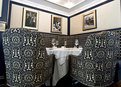
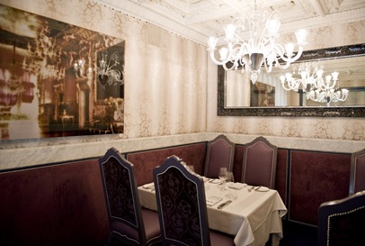
In honour of the restaurant's 10th anniversary, the owners brought in Taylor Hannah Architect to revamp the interiors. Inspired by the classic proportions of the historic Harbour Commission building that houses the restaurant, Hannah and her design team transformed the tired masculine and Mediterranean-infused aesthetic into a gleaming jewel box with several classy compartments. Gone are the tired striped walls, deep red woods and paintings of angels - instead there is now a hefty dose of jewel tones, gleaming polished nickel accents and luxurious finishes and fabrics that ooze luxury.
Here are some snapshots of the various areas of the restaurant, but before you scroll down, check out the before photos on the restaurant's website or on Dee Dee's Blog.
THE BAR
The bar area boasts a back-lit onyx top, banquettes covered in fabric interwoven with copper and custom bar stools with polished nickel accents. Unique wall treatments include crocodile-embossed leather and mother of pearl wall tiles, and the black and white vintage fashion photography adds a chic retro throwback that oozes class.
THE GALLEY
Patrons can watch the delectable dishes being prepared in the open carrera marble kitchen when sitting in the galley. The blue agate front is mesmerizing, and the the silver-leafed domes and graphic marble floors are so glamorous.
FORMAL DINING ROOM
The formal dining room is so luxurious with its cut crystal lighting, velvet banquettes and rich tones of blue and violet. I love how the dramatic drapery pelmets frame the suspended custom canvases by local artist Joshua Jensen-Nagle.
LOWER LEVEL
The lower level is amazing with its graphic black and white scheme. Italian marble flooring, inspired by the lobby of the legendary Carlyle Hotel in Manhattan is super sophisticated, and the iridescent mosaic tile in the stairhall is simply dazzling! Fluid black murano chandeliers pop against the damask-clad walls and chairs with fabulous carpeting from Stark.
I love the design scheme so much because it doesn't subscribe to the same old-man-stuffy look seen in most traditional steak restaurants. It is luxe and glamorous and appeals to both genders for a change!


1 comment:
Oh my gorgeous!
Post a Comment